Go to

#drawing

DSC_1419
Pencil and paper are not the only tools of a modern artist – there is now something new, loved by designers, artists, and other creative souls. A tablet!
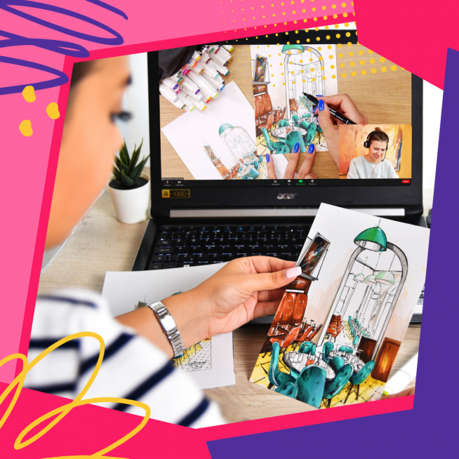
The iPad does a great job at substituting a computer, allowing users to watch videos, play games, and use graphic editors.
Here’s an overview of graphic editors and drawing software for iPad Pro:

Astropad
This clever program allows you to connect your iPad to the computer and use it just like a Wacom drawing tablet, with everything you do on the tablet showing on the screen.
Adobe Draw (Illustrator)
Adobe Draw is designed for vector work, giving your tablet more powerful options and allowing you to create vector illustrations. Illustrator is especially popular among logo designers, so if you are looking to take your logo game to the next level, this is the software for you. Like with all Adobe programs, you will have to pay to use it.
Let’s also talk quickly about how it works. On the left, you will find a toolbar, while the layers are displayed on the right. If you want to do some vector work, you can also upload a raster image (your own creation or something downloaded from the web) to serve as a template for your vector drawing. However, you can also simply start working on a blank canvas – it’s completely up to you and how confident you are in your skill.

Photoshop Adobe Sketch
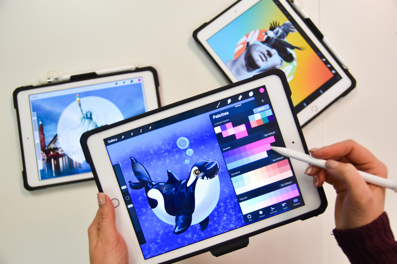
This Adobe program is designed for raster work and it has some great watercolour options, allowing you to create transparent layers that blend together like real watercolours. Sketch comes with a great variety of tools, colours, and textures; you can work with pencils, pens, create your own brushes, and explore a plethora of other options. As an added bonus, this program is available free!Procreate
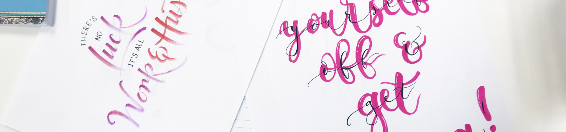
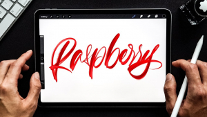
The second most powerful illustration program bested only by Illustrator itself. With a wide variety of tools and an option to adjust the pen sensitivity, it allows you to create perfect, seamless linework, beautiful backgrounds, work with masks or colours, and work on your lettering and calligraphy. The best way to get acquainted with the possibilities of Procreate is through the already mentioned lettering work.

For instance, you can easily create Copperplate calligraphy using Procreate’s drawing tool. You’ll find it very simple to use and very similar to using a real pen – the line thickness reacts to the pressure you apply to the stylus, just like with real ink pen. There is also the Streamline feature that you can turn on and off, depending on whether you want it to smooth out uneven lines. But be careful, this feature will make you feel like the stylus is drawing by itself! There is also a neat feature to help you draw straight lines. Start drawing your line, then hold at the end without lifting the stylus and watch it straighten.

Writing on a tablet might seem more difficult than using the good old pen and paper at first – the tablet’s surface is very slippery and doesn’t have any grip like paper does, which allows for better control. But on the other hand, you have the option to change your creations as much as you like and work on them for as long as you wish.

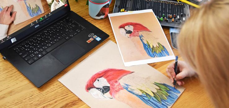
Obviously, this is a very limited list and there are many more programs you can use with your iPad and take your first steps into the future of creativity, just like thousands of artists all around the world before you!

Come to our calligraphy and illustration course to try doing creative work with an iPad! Sign up and let our amazing teachers help you get familiar with the new, amazing options of digital art.

Digital lettering – a calligraphy course with iPad Procreate:
Sketching and illustration with iPad Procreate:
aecb0c21a8f2828de1a76cc4cce3ae1d

Sometimes you really want to draw something, but just can’t decide what and end up not drawing anything at all because of how unmotivated you become by the undecidedness. Sound familiar? We know that feeling too, and that’s why we have put together a list of 25 topics and ideas for when you get that sketching itch. 

  • City sketching – capture some of your favourite places 
  • Quick sketches of people on public transport
  • Put your dreams and ambitions on paper
  • You can never go wrong with a self-portrait
  • Create your own world in your own comic strip – and don’t get discouraged if it doesn’t look like a Marvel or DC production 
  • Make fun of your friends and draw their caricatures
  • Make a study of the human body – try skull or muscle anatomy, or a hand – few things are more difficult to do well than hands
  • Recreate your favourite moments from movies or series
  • Try bringing some flora and landscape into your sketchbook, and if you love being outside, take your sketchbook with you
  • Imagine you are a graphic designer and create a new logo for your favourite band
  • Draw a place that you’d like to visit someday
  • A still life is always a great option – find inspiration in the items around you, inside the fridge, or try copying a picture from the internet
  • Try making some cool tattoo designs
  • Whip up some fun clothing prints – what would your own t-shirt look like?
  • Try capturing your future the way you want it to be
  • Create illustrations for your favourite book
  • Empty your purse or pockets and draw what you see – this is also an exercise you get to try at our sketching course 😊
  • Design whatever you feel like – from a piece of furniture to an entire room
  • Try your hand at architecture, starting with simple scenes and working your way to full streets and blocks
  •  
  • Draw some food (not recommended when you’re hungry, though 😊)
  • Draw scenes from a normal day in your life
  • Capture your workplace or workspace
  • Spend some time just doodling (draw pictures or patterns without focusing on them but instead thinking of other things) – you may be surprised with the results
  • What was the best day of your life? Try putting that amazing memory on paper
  • And most importantly – draw things that make you happy 😊

Do you want to learn to capture the world around you? Come learn all the sketching tricks with us! It’s not nearly as hard as it might seem and soon enough you’ll be able to capture items, food, streets, nature, and people with quick sketches!


Colour mixing theory

10. February 2022

MicrosoftTeams-image

Painting is more than just applying pigment to a canvas, and the way you mix colours is just as important as your style or technique. Choosing the right shades can greatly affect the emotions conveyed by your painting – just think of Picasso’s “Blue Period” works. Would they have the same effect without those blue tones?

Whatever medium you are using, understanding and learning to mix colours properly is key. Most beginner artists tend to use only the colours that come directly out of the paint tube, but these shades are often oversaturated, flat, or simply unnatural. By learning to mix colours, you can create much more beautiful shades and save some money on top of that too since you won’t need to purchase a tube of every colour you might want to use.

To help you truly master the art of colour mixing, we put together a simple colour theory overview.


  • PRIMARY COLOURS 


The primary colours are blue, yellow, and red. All other colours are created by mixing these three together, so if you want to keep your palette minimal, primary colours are a must since you can mix any other shade using just them.


  • SECONDARY


When you mix two primary colours together, you get a secondary colour. Red and blue result in purple, blue and yellow in green and finally, red and yellow will result in orange.


  • TERTIARY 


As the name suggests, tertiary colours are created by mixing primary and secondary colours. There is a total of six tertiary colours: vermilion (red–orange), amber (yellow–orange), chartreuse (yellow–green), teal (blue-green), violet (blue–purple), and magenta (red–purple). These shades can vary, and you are free to adjust them as you see fit. For instance, you can make your vermilion more yellow and less orange by working with ratios of each composite colour.

Colours are all about ratios, and one shade can look very different depending on how you mix it. Always keep the colour wheel and each colour’s position in mind when pairing and mixing different shades. The colours that are opposite of one another on the wheel are complementary colours, which means that red and green, blue and orange, and purple and yellow will always look great together.

Colour mixing is a bit of a mysterious discipline, like alchemy, and it certainly requires a lot of practice to go with the theory. Join us at our oil painting course for beginners and learn the secrets of colour mixing with us!

https://drawplace.drawplanet.cz/kurz/kurz-kresleni-a-malovani-pro-uplne-zacatecniky/

How to draw a rose

9. February 2022

как-нарисовать-розу-27

Roses are one of the most popular flowers out there, often considered to symbolise love. Composed of many layered petals, they are notoriously hard to draw since you have to work in layers too before you can move on to shading.

You will need:

  • A hard pencil (like HB)
  • A medium pencil (2B or slightly softer)
  • A soft pencil (5B or softer)
  • A sheet of paper
  • A pencil sharpener

Step 1
Use a hard pencil to draw a drop or egg-shaped outline – this is the inside of the rose, the bud.

Step 2
Draw the “opening” part.

Step 3
Add petals inside.

Step 4
Think of a heart shape when drawing these petals; they will also work as the edge of the other petals.

Step 5
Connect the “heart” to the rest of the bud to create a petal shape.

Step 6
Draw another heart, this time connecting it to the lower part of the bud.

Step 7
Draw another heart, making it more open and less smooth this time.

Step 8
Now it’s time to add more petals. Think carefully before adding each of them – too many will only cause you to get lost in the picture.

Step 9
Now it’s time to plant the bud into a “bowl” of petals. Start by adding small petals and continue working, adding more and more of them.

Step 10
As you add petals, make sure to make them point more and more downwards, as if they were almost laying down.

Step 11
Once you are satisfied, put a bit more pressure on the pencil in the areas that you want to accentuate with shading to mark them

Step 12
Now grab a softer pencil and darken the inner parts of the rose. Start with light strokes first…

…then add more pressure to create deeper shadows.


Step 13
Use the same pencil to place dark accents at the tips of the petals, but don’t go over their entire outline!

Step 14
Now use the hard pencil again and use it to add light structure to the parts that are “lit”. The more shaded the fragment is, the crisper your lines should be.

Step 15
Finally, use the softest pencil to add final strokes to the dark parts, especially in the darkest folds.

All done – you know how to draw a rose now!

Would you like to learn to draw other things too? Sign up for our beginners’ drawing course at https://www.drawplanet.cz/kurz/kurz-kresby/ and learn to work with pencils, charcoal, pastels, ink, and other exciting media!

Kak-narisovat-kota-karandashom-pojetapno-1

Did you know you can draw a cat in five steps? Follow us and see for yourself! First, you need to determine where the cat’s head is going to be on your paper. Then, draw a big oval with a smaller oval inside and two lines for the cat’s neck. Next, add two parallel lines right above the smaller oval – the cat’s eyes will go between them.

Step two – draw two more ovals for the cat’s eyes, add the ears and try to shape the face to be more catlike. You can see a cat’s face coming together already in the picture below.

Step three – the nose. At this stage, it can be a simple triangle. Our main goal right now is to make sure everything looks even and level, with no elements being askew or looking “weird”.

Step four – adding more details and definition to the cat’s eyes, ears, nose, and mouth. Don’t rush and take it one thing at a time – work on the ears first, then move on to the eyes and finally, to the nose. Use the picture below as a reference and try to mimic what you see.

Finally, in comes hatching and shading! Make sure you have pencils ranging from 2B to 6B at the ready, look at the reference picture below and try to copy the light and dark areas. Look closely and pay attention. Use the 6B pencil for the darkest areas and the 2B pencil for the lightest. That means you will use the 6B around the eyes, mouth, and ears, and the 2B for the eyes themselves. Don’t be nervous about making a mistake – you can always fix it with your eraser.

That’s it, you just drew a cat! Want to learn more? Then our drawing course is just the thing for you! https://www.drawplanet.cz/kurz/kurz-kresby/ Join us at Draw Planet to learn to draw things, animals, people, and much more step by step. Simply click the link, register, and start learning! 😊

How to draw hair

5. February 2022

2e67119408d89c2ffb102b987c884e79

Drawing hair may seem daunting and difficult, but it’s really not that bad! The secret is the hair structure – unlike other head and facial elements, hair doesn’t have too many unique, defining characteristics; it only differs in colour, volume, and waviness. That’s why we will learn to draw a face actually starting with the hair before adding other features.

Real-life anatomy

Hair plays an important role in portrait construction since it makes up for a large portion of the actual head shape – and that’s why you need to be familiar with the anatomy of a skull.A skull is much like a ball, but if you just add some hair around it willy-nilly, your human will look more like a poodle-alien. To avoid this, keep in mind that a human skull is not, in fact, a perfectly round ball.

The forehead is more like a flat wall, with ears connected by temporal bones that are more airplane shaped. Only the parietal and the occipital bones are actually sphere shaped. 

Always keep the head shape in mind – regardless of the hairstyle, there is always a skull underneath it, with the hair following the skull shape or standing out, not shaping the skull.

So how do you draw hair?

Now let’s get to work and learn to actually draw some hair step by step.

First and foremost, don’t draw hair without having a base – that would be the skull. Try to define the main parts of your hair by following the skull shape and decide how the hair will be arranged geometrically. Follow the temporal (front view) or the parietal or the occipital bone (profile and three-quarter view). Pay special attention to the little curls on the forehead.

Remember that hair is much better at reflecting light than our skin and keep this in mind when shading and adding highlights and contrast. To add shading, use long, neat strokes following the shape of the head, basically adding individual hairs. Make sure you know how to properly hold a pencil to keep them nice and neat. Let’s not forget about aerial perspective too! Only the hair closest to the viewer should be visible; the hair in the background will usually merge into a single body. To achieve this effect, simply use a piece of paper to blend out your strokes. When you feel confident about being able to follow the rules above, go ahead and dive into your first hairstyle!

Pencil

Let’s go back to the top of the head for a moment. There is a secret you need to know – you can do all of the above without a model or a reference picture since all heads are built following the same set of rules.

Try and see it for yourself – get yourself a life model (with hair, obviously – bald models won’t do here) who is ready to be immortalized on paper and compare the scheme to what you see. 

Now let’s find the frontal eminences (two rounded elevations on the frontal bone of the skull) – they are usually located at the intersection point of the upper row of the square we used to draw the face in and the vertical sides between the eyes and the ears (closer to the ears). These points mark the zones between the eyes and ears (the frontal and the parietal zone).

You will also need to determine the height of your hairstyle – go ahead and draw the shape of each zone, keeping the added distance in mind.

Now add detail to hair strands around the forehead and give them the desired shape, then move on to shading when you feel like your hair construction is done. Start from the darkest areas (shadows and cast shadows), then move on to midtones and finish with highlights.

Here’s a useful little trick for you: grab a rectangular eraser and cut it across, creating two triangle pieces – now you have two erasers with fine tips to comfortably erase the smallest lines and add gentle highlights and glowing spots of light!

Highlight the hairs in the front with bold, confident strokes and add any hair that is not on the parietal plane around the edges. 

Are you intrigued and ready to start? Dive straight into it, and if you want to learn from the best, sign up for one of our courses! We suggest taking a look at our portrait drawing course to really master hair with ease and confidence.


Drawing emotions

4. February 2022

sQiDbZM

There are millions of eyes, ears, mouths, and chins around the world, and each of them is unique. However, they share some basic features that you need to get down to draw nice faces. And if you want to make your drawings even better, you need to learn to capture emotions and facial expressions.

Anyone can draw a face, really – you can simply draw a circle with two dots for the eyes and a couple of lines for mouth and nose and call it a face. Yet despite the simplicity of the basic facial construction, most people struggle when it comes to drawing emotions.

What does a face do?

You can change your facial expression as easily as you can change the tone of your voice. One thing that we must understand is that facial expressions are not created just by muscle contraction – it’s a combination of some muscles contracting and some relaxing, and in some cases, like a smile and a laugh, the only difference is in the contraction intensity.

Basic emotions

Basic (primary) emotions are those that we can’t fully control – they manifest themselves automatically, with not much control from us. A basic emotion can happen out of the blue, for instance, when you instinctively react to an impulse.

These primary emotions express themselves universally, regardless of culture, race, or age. So which emotions are primary? Here are a few examples:

1. Happiness: corners of the mouth are pointing up, brows are raised, eyes are open.
2. Anger: corners of the mouth are pointing down, brows are wrinkled towards the nose bridge, eyes are open.
3. Fear: the mouth is curved with corners pointing down, the brows are pointing up, eyes are open.
4.  Sadness: corners of the mouth are pointing down, brows are slightly raised around the nose bridge, eyes are narrowed, gaze is down.


These are the four facial expressions that we use most often. We can use the drawings of these four emotions to derive what other emotions will look like on paper.

There are two more emotions that are less frequent, but they are also a part of the primary emotions group:
5. Surprise: mouth is small and half open, brows are raised high, eyes are open..
6. Disgust: mouth is curved, brows are completely wrinkled, eyes are closed.


Notice that these two expressions are actually modified expressions from the first group.

Right now you are probably surprised by how few primary emotions there are. It’s really simple though – just like you can make different colours by mixing the basic ones together, you can also mix the primary emotions to create more of them – the secondary emotions. Take a look at this example if you don’t believe us.

Derived emotions
These are emotions that are based on the primary ones. When drawing them, you can change just one facial feature of a basic emotion to obtain new, more nuanced ones!

Notice that we only changed the mouth but got two very different expressions just by doing that! Here’s another example of how just one element can change the entire emotion:


Again, we only had to change the mouth to change the entire emotion.
We can also change both the eyes and mouth to create yet another emotion, still based on the primary ones.


Furthermore, we can also combine and alter secondary emotions to create “tertiary” emotions! Just look at the example below:

The only thing we changed was – again – the mouth.

Fascinating, isn’t it? You can create dozens or even hundreds of different emotions just by altering different facial features and combining different expressions!

Emotions expressing physical states
Emotions that show how we feel physically are close relatives of the primary emotions, but unlike them, they can take on individual, unpredictable forms.

Notice that these “physical” emotions are, too, derived from the primary ones. Here you can see that tiredness is derived from sadness.

To make these “physical” emotions more prominent or specific, we can add extra features, like dripping sweat:

Now let’s take a look at a physical reaction we can’t fully control. Our poor character got a small electric shock, completely losing control over how they reacted.

It is also important to keep in mind that primary emotions are the most frequent and prominent. Shock, however uncontrolled, is just a version of fear. The most interesting thing about the “physical” emotions is the fact that we experience them every day, without even realising it’s happening, with external factors and other conditions to blame for that.

Intensity and other elements
In cartoon drawing, there is no limit on the intensity of facial expressions, so we can play with it as much as we like.

You can also add other elements to enhance emotions – like drops of sweat to enhance the feeling of fear, or a tongue sticking out to show how extremely disgusted our character is.

Would you like to explore emotions and facial expressions even further? Then come join us at our comic drawing course to get a ton of practice and learn to capture body language as well!

https://drawplace.drawplanet.cz/kurz/kurz-komiksu/

How to draw a tree

3. February 2022

как-рисовать-деревья-20

One would think that a tree is one of the simplest things you can draw…but if you have never been too much into drawing, chances are your tree will end up looking too simplistic…


… or too detailed.


Neither of these two pictures resembles a real tree – the first is more like a symbol, while the other is more of a definition of a tree. But as an artist, your main task is to capture what you see, not what you know, and drawing trees is a great way to practice this.

In this blog post, we’ll teach you to draw a very realistic oak tree using a very simple method.

You will need:
–  a couple of sheets of paper;
– an HB pencil;
– a medium-soft pencil (2B);
– a soft pencil (5B);
– a pencil sharpener.

You can also make do with a couple of hard HB pencils, but they are not versatile enough to be used in any type of drawing – you need soft pencils to create rich, dark shadows, something you can’t achieve with hard pencils, no matter how hard you push.

Make sure to have a pencil sharpener handy as well – a blunt tip creates lighter and blurrier strokes that don’t match the expected result. Keep your pencils sharp and keep in mind that soft pencils blunt faster than hard pencils!

As for the paper, you don’t need anything too fancy – simple printer paper will do. Don’t make your drawing too big either – the smaller the picture, the less detail you need to add. For reference, the drawings you see in this article are only 9 cm tall.

Our brain works in a curious manner – it notices an entire object first and starts paying attention to details next. And that is why you don’t need to start creating your drawing from the details – you need a base first.

Step 1

Use a couple of very light strokes and dots to outline a simple tree shape. Use a harder pencil (HB) and don’t apply too much pressure – these strokes will not be a part of your finished drawing.

Step 2

Draw a trunk, making it wider at the bottom and narrower at the top. The bigger the tree, the shorter and wider the trunk.

Step 3

Add branches to the upper part of the tree. Keep in mind that tree branches gradually lower down as they grow and make sure to capture that as well.

Step 4

Draw smaller branches growing out of the large branches. The longer the branch, the lower the splitting begins. Keep your strokes light.

Step 5

Use short, quick strokes to outline the treetop and don’t make it too even.

Step 6

Draw the little leaf “clouds” in the treetop with the same short, quick strokes. Leave some areas empty to make some branches visible and make your drawing more lifelike.

Step 7

Make the branches thicker where there are no leaves covering them.

Step 8

Before you start shading, decide which part of the tree will be turned towards the light and where the shadows will be. You can outline them with simple hatching.

Step 9

Use a soft, sharp pencil (2B) to add texture to the trunk, leaving some white parts to capture the bark texture properly.

Step 10

Use soft pencils (2B, 5B) to darken the trunk, keeping in mind where you decided to put your light source and the corresponding light/shadow distribution. Don’t be afraid to apply more pressure to a soft pencil to get a deeper shadow but be careful to not overdo it. The fewer black areas you’ll have in the picture, the more realistic and impressive it’ll look.

Step 11

Grab a hard pencil and add leaf shapes by drawing relaxed, loose circles with quick, sharp movements.

Step 12

Every branch has its own little “treetop” (remember those “clouds” you drew?). Draw them as if they all were small separate trees. 

First grab a soft pencil (2B) and use it to make darker circles on the darker side of the tree. Don’t apply too much pressure at first to make it easier to correct potential mistakes. 

When you are sure that you have determined where your shadows will be correctly, add the shadows and depth, creating a transition between the dark and light parts.

Step 13

Use a soft pencil (2B) to add a couple of more pronounced leaves to the entire treetop and each individual “mini treetop” to create an illusion of more barely visible small branches.

Step 14

Now use the softest pencil you have to add a few dark accents to the darkest areas of the tree as well, creating more contrast in the treetop. Make sure that all leaves are darker than the “sky” (your background) – no leaves should appear transparent! Go over the light areas with a hard pencil one more time if necessary. 

So, drawing a tree wasn’t that hard, was it? All you need to do is capture their real appearance, not a definition of a tree from a dictionary. But this is just the start of your practice – if you want to become really good at drawing trees, make it a habit to carry a sketchbook with you when you go for a walk, look at the trees around you and try to capture them with quick sketches.

Do you love nature? We do for sure, which is why we have an entire course on painting and drawing landscapes at Draw Planet! Learn to work with pastels, coloured pencils, watercolours and oil paints, all the while creating amazing pictures of beautiful flora 😊

Drawing hands

3. February 2022

MultAXn

There seems to be a consensus among artists that hands are the most difficult thing to draw, with every artist having their own slightly shameful examples of hiding the hands of their characters inside their pockets or behind their backs just to avoid having to draw them. It is, therefore, rather ironic that we always carry the best model one could wish for with us, and right in front of us most of the time – our own hands. Using a mirror and a little effort, we can learn to draw hands in basically any position, from any angle. The only catch here is the fact that hands are very complex tools with many joints and other small details that often leave us at a loss and unable to decide where we even start.

The easiest way to draw a hand is to start with the palm – it should look like a round, rectangular or trapeziform steak with rounded corners, with fingers connected to it.

Now, if you have trouble drawing fingers, think of every finger as a series of interconnected cylinders – this should help you draw fingers from any angle. Just look at the picture below – cylinder edges become the lines where the fingers bend at the joints.

Don’t forget about fingernails either and learn to understand when you do and when you don’t need to draw them. As a general rule, only draw fingernails when the hand is close to the viewer and needs a lot of detail.

Overall, hands are very different and individual, just like faces. Men’s hands are different from women’s hands, old hands look different compared to young hands, and so on. You can see examples of some hand types below, but these are just a few examples of many, and in no way is this a representation of the whole range of hand diversity. When it comes to hand variety and differences, you’ll find that hands do have their own character too. 

-Different finger to palm ratios

-Finger shapes

To make matters even more complicated, fingernails are very different person to person as well! And even if the nail bed is the same size, manicure can still make them different.


Simple exercise
Examine your hands and the hands of other people. How are the fingers arranged? What are the differences between men’s and women’s hands? What about your grandma’s hands and your hands? Can you recognize your friends just by their hands? Sketch hands that you see around you or use referenceimages instead. Don’t worry about ratios – focus on capturing what the hands are doing. Try drawing your own hands in different positions, use a mirror to see them from different angles and views, always starting your drawing from the simplest shapes. You can also start with quick, energetic sketches and add details to them later.

Come join our figure drawing course and learn to capture the hands of live models (and much more) with our amazing teachers. We look forward to seeing you!


Jacksons_Tones_Atmos-1024×683

Every skin tone contains three basic colours – blue, red, and yellow – in different ratios depending on how light or dark the skin is, whether it’s in the shadow or out in the light, and also depending on the body part. For instance, thin skin, like that on your temples, tends to carry cooler shades while the tip of the nose is usually darker. The first thing to keep in mind is that there is no magic recipe to create the perfect, universal skin tone – you will have to learn to mix your own skin tones, and that’s where the colour ratios come into play.

Now that we’ve established how different skin tones are, our next piece of advice is to avoid those paint tubes with “universal skin tone”. You could use them as a base for mixing the shades you really need for your portrait, but since these pre-mixed skin tones are just a basic mix of blue, yellow, and red, there is no reason why you can’t do that yourself.

A simple mixing method

Start by mixing the same amount of each basic colour together – this will result in a brownish colour, a base that you will lighten and darken, make it warmer or cooler.

Note: if you get more of a greenish colour, simply add more red to balance it out since some paints and colours can be more dominant than others.

In portrait painting, just like in landscapes, your best bet is to try to capture the colour you see as closely as possible. Take a good look at the colour on your model picture or your live model’s body and try to create the same shade on your palette, comparing it to your model as you go to fine-tune and perfect it. Think of these questions as you work towards that perfect shade.

  1. Do I need a lighter or a darker shade? If the answer is lighter, add yellow or white. The white will also make the shade cooler and more coating, while the yellow will add warm undertones. Use dark ochres, rusty shades (like burnt umber) or chromatic blacks (like burnt sienna combined with ultramarine blue) to make your mix darker.
  2. Do I need a cooler or a warmer shade? Add blue (or white to simultaneously lighten the mix) to make your shade cooler. Use yellow or warm red to add warmth to your skin tone mix.
  3. Do I need to make my skin tone more or less saturated? Use the opposite colour to balance things out.

You can also use earthy colours like ochre, rust, or black shades, but keep in mind that even these can be created by mixing the three basic colours together. In the end, it’s up to you to decide what mix works best for you.

An example palette

Let’s take  a look at some colours that you can start with and then add, remove, or change colours on your palette to your liking.

  1. Titanium White
  2. Cadmium Red Light
  3. Cadmium Yellow Medium
  4. Ochre
  5. Burnt Sienna
  6. Burnt Umber
  7. Ultramarine Blue

For light skin tones, use a mix of 1, 2, 3, and 5.

For medium tones, use 2, 3, 4, and 5.

For dark skin tones, use 2, 5, 6, and 7.

Create a series of different shades for different colours that you use – for instance, keep adding more and more white to Cadmium Red, creating a variety of shades available to you. Do the same for your skin tone mixes to create a perfect dark-to-light palette to use for adding shadows and highlights to your portrait without having to mix a new shade from scratch every time.

A tip to get you started in skin tone mixology

Start by looking at your own skin and try to mix shades that match your hands. Take note of how different colours and shades look depending on different lighting and light sources. Next, try to mix a shade that matches your face, examining the colours and different shades you see in the mirror. Then, try to mix them from memory. Printing out pictures of people and trying to mix a shade to match their skin is also a great way to practice. Also, did you notice that not once did we use orange or pink  like we used to do as kids? 😊 

Want to learn more and become a real pro? Join us at our portrait drawing and painting course. We look forward to meeting you!

1-2017-Olejomalba-Pokracovani-1-44

Our newsletter!