In this article, you will find useful advice for making your logos. We’ll discuss the basic tools and how to use them first and then move on to making a retro café logo, step by step!
Lesson details:
Software: Adobe Illustrator
Difficulty: intermediate
Time: 1 hour
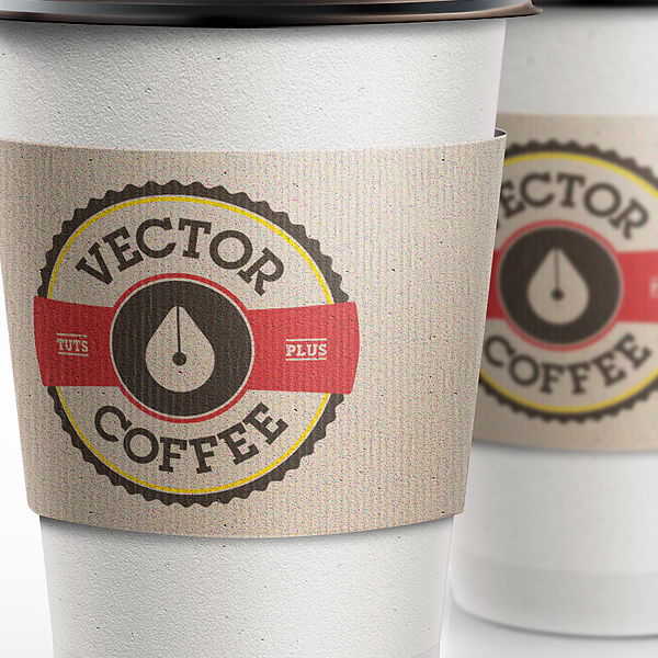
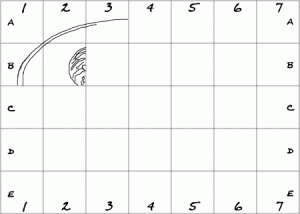
Final result:

Discussion with the client, brainstorming
The first thing you must do before you start making anything is to talk with your client to get as much information from them as you can. The more you know about their company or product, the easier it will be to come up with a good logo.
The internet is full of articles with lists of must-ask questions that will help you learn as much as you can about your client’s business, so we won’t delve into that. The key thing to keep in mind is that you are working for the client and their brand, which means you must respect their wishes and preferences if they are adamant about them. It was the client who came to you, after all, which means they respect you and your skills, and it’s up to you to prove they made the right choice by trusting you.
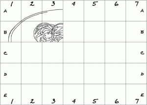
As far as initial sketches go, it is key to offer several options to the client. How many exactly will often depend on the client’s brief, but most professional designers provide around 10 initial sketches to choose from. Next, you need the client to select two or three they like best. Make sure to ask the client why they chose them and take notes to have the client’s favourite features on paper. Discussion and dialogue are key at this point, as you will usually need to make two or three more detailed versions of every sketch.
At this stage, the client is always right. You, as a designer, may think that version X is better than version Y, but you must put your own emotions aside and act like a professional. Listen to the client, to their ideas and wishes, and try to gently put their not-so-great ideas on a better track. Avoid reacting too quickly or too harshly, as you’ll only damage your own name.
Making sketches
In this tutorial, we will be making a logo for the Vector Coffee brand. After some research, we learned that the company prefers a clean, vibrant design with a modern or retro twist.
The company’s fonts, colours, and any shapes that are or might become a part of the brand’s identity are important here, and you must clear this up with the client before you get down to sketching. The final logo must also be usable both online and in print, so keep in mind that while some effects or colour transitions might look good on the screen, they can lose quality or be too expensive in a printed version. Keep your colour scheme on the minimal side and image the logo on different backgrounds. Readability is another key feature, and the dangers are the same – a text that is perfectly readable on screen can lose readability when printed on an envelope, for instance. Make sure that your logo retains its quality at smaller sizes as well. If it doesn’t, you need to reconsider your design.
For this logo, the key idea was to combine the words “vector” and “coffee”. We explored various combinations of coffee beans and drops with general vector graphics concepts like the Pen Tool and reference points, finally arriving at a classic round shape with a wavy edge and text inside. After discussing the idea with the client, we added a symbol representing coffee to our list of elements as well, choosing a drop of coffee that also resembles a pen that, in turn, represents the Pen Tool in almost all vector graphic editors. For the colour scheme, we chose black to represent the hot aspect of coffee, golden yellow to bring feelings of warmth and joy into the design, and a rich brown colour representing freshly brewed coffee.
1. Create a new document
Now that we have our sketch, it’s time to move on to the next part of the process – the vector image. Avoid working with raster versions to prevent any doubt about your professionalism in your client.

Start Illustrator and create a new document with the necessary settings.
2. Create a wavy shape
Step 1

We have our digital canvas, so let’s get to work. We’re not going to import the sketch here since we only did a very rough version, but you can import yours if you want to.
Select the Star tool (it’s right under the Rectangle Tool) from the tool panel. Activate the tool by clicking on its icon, then left click your canvas. A Star options window will pop up asking you to choose the number of peak points in your star. Enter the values you see in the screenshot. When you have your “star”, click on Window-Transformation and set the size to 448×448 pixels. Next, turn the star 90 degrees counterclockwise to keep the top point of the star where it needs to be.
Step 2

Select your star shape by clicking on it and go to Align (Window – Align) and select Align to Artboard, then Vertical Align Centre and Horizontal Align Centre.
Step 3

Once your star shape is centred on the canvas, go to Appearance (Window – Appearance) and choose the brown colour (which was specified in the brief provided by the client). Next, click on the Effects button in the lower part of the Appearance panel, choose Stylize – Round Corners and enter the values shown in the screenshot.
Step 4

Select the Ellipse Tool and click anywhere in your canvas, then make a circle 406 x 406 pixels big and centre it like you see in the screenshot.
Step 5

Click on the Selection Tool, hold the Shift button and select both the circle and the star shape. Next, go to the Pathfinder panel (Window – Pathfinder) and select the second icon on the left called Minus Front to finish your star shape.
3. Outer and inner rings
Step 1

Use the Ellipse tool to create a 400×400 pixel ring and centre it on your work.
Step 2

Go to Appearance (Window – Appearance), remove the fill and add a yellow stroke 5 pixels wide (we are basing the strip’s properties on the information we have on the brand).
Step 3

Go to Object – Expand Appearance. This command will prevent the rows from changing their size value when the logo goes into print and its size is changed. Now, your logo will always look the way you intended.
Step 4

Make another circle close to the centre, to balance the text that will be added later. Select the Ellipse tool (shortcut: L) and make a 190 x 190 pixel circle, placing it at the centre.
Step 5

Go to the Appearance panel, remove the fill and add a 6-pixel stroke in a nice, vibrant red.
Step 6

Finally, use Object – Expand Appearance again.
4. The coffee drop
Step 1

Go to Window – Layers and turn off layer visibility by clicking on the eye icon next to the layer name. By default, it should be “Layer 1”. Then, create a new layer – you should have two of them now, with the newest being on top and visible.
Step 2

Select the Ellipse tool (L) and make a 300 x 300 px circle, then make sure to centre it on your canvas.
Step 3

Using the Ellipse tool, create another circle, 70 x 70 px, and centre it too. Make it a different colour so you can work more comfortably.
Step 4

Right click the smaller circle and select Transform – Move (shortcut: Shift-Cmd-M) and enter the parameters shown in the screenshot.
Step 5

Choose the Selection Tool, hold Shift and select both circles at the same time. Next, go to Object – Blend – Blend Options, make sure that the “Smooth Colour” option is on and click OK. Finally, create the blend by navigating to Object – Blend – Make (or press Alt+B).
Step 6

Navigate to Object – Expand Appearance. This will create many layered, overlapping circles.
Step 7

Go to Pathfinder (Window – Pathfinder) and select the first icon on the left (Unite) to unite the shapes.
Step 8

At this stage, there are many anchor points that need to be removed. To accomplish that, zoom in, click on the Direct Selection tool (or press A) and drag the selection to the unwanted anchor points. Keep in mind that the top and bottom anchor points must remain intact though! Once you have selected all the anchor points you want to remove, press Backspace to remove them. Finally, go to Path – Join (Cmd-J) to close the open paths. This step must be done twice.
Step 9

Now let’s give some love to the drop shape. Use the Ellipse tool (L) to make a 60 x 60 px circle of any colour that is clearly visible against the drop.
Step 10

Select the Rectangle Tool and create a long thin rectangle 10 px wide going out through the top of the drop.
Step 11

Navigate to Selection tool (V), press Shift and select both the circle and the rectangle. Next, go to the Pathfinder panel (Window – Pathfinder) and select the first icon on the left (Unite) to unite the shapes.
Step 12

Hold Shift and select the drop and the circle with the rectangle, then head to the Pathfinder panel (Window – Pathfinder) and click on the second icon on the left (Minus Front).
Step 13

Navigate to Transform (Window – Transform) and click on the chain icon to the right of the height and width window to limit height and width changes. Enter 90 px in the Width window and centre your object to the centre of the canvas.
Step 14

Select the Ellipse tool (L) and make a 182 x 182 px circle, as shown in the screenshot. Now select, right click and go to Arrange – Send to Back (Shift + Option (Alt) + [). Next, switch to the Selection tool (V), hold Shift and select the two shapes. Go to Pathfinder (Window – Pathfinder) and select the second icon on the left (Minus Front) to change the colour to brown.
5. The red part
Step 1

Go back to Layer 1 and choose the Ellipse tool (L) to make a 460 x 460 px circle, fill it with red, and centre.
Step 2

Switch to the rectangle tool (L) and make a long rectangle, 125 px tall and wide enough to overlay the circle.
Step 3

Now hold Shift to select both the circle and the rectangle. Go to Pathfinder (Window – Pathfinder) and select the third icon from the left called Intersect.
Step 4

Next, go to Appearance (Window – Appearance) and select Effects in the lower part of the panel, then go to Stylize – Round Corners and enter the values shown in the screenshot. Now go to Effects and select Warp – Bulge and enter the parameters shown in the screenshot. Finally, navigate to Object – Expand Appearance.
Step 5

Select the Ellipse tool (L) and make a 195 x 195 px circle.
Step 6

Switch to the Selection tool (V), hold the Shift button and select the circle and the warped rectangle. Navigate to Pathfinder (Window – Pathfinder) and select the second icon from the left – Minus Front.
Step 7
Select the Magic Wand Tool and click the red shape. Go to Pathfinder (Window – Pathfinder) and click on the first icon on the left called Unite.
6. Adding text
Step 1

Select the Ellipse tool (L) and make a 295 x 295 px circle, then remove the fill and stroke.
Step 2

With the new circle selected, go to Type Tool (T), hold the Alt key and select the highest anchor point, then change the font colour to the same brown and write VECTOR using the font chosen by the client. In this case, we are using the Lubalin Graph font. Go to Paragraph (Window – Type – Paragraph) to make sure your text is centred.
Step 3

Click the Type Tool and adjust the alignment as shown in the screenshot, then switch to the Selection tool (V), grab the corner of the frame and rotate the text to centre it.
Step 4

Using the Selection tool (V), copy the path (Ctrl+C) and bring it to the foreground (Ctrl+F). Navigate to the Type Tool again and change the text to COFFEE, then flip the text to have it mirrored. Click the Type Tool and select the Flip option, then click OK.
Step 5

Now let’s adjust letter spacing. Select the two Fs and set the alignment value to 90, then do the same between F and E and the two Es.
Step 6

Use the Selection tool (V) to select all text and go to Object – Expand.
Step 7

Now let’s add more elements. Use the Type Tool (T) to write TUTS and adjust the text size accordingly.
Step 8

Make the text bigger and use the Rectangle Tool (L) to draw rectangles above and below the text, making them as wide as the text and 3 px tall and placing them 4 px from the text.
Step 9

Use the Selection tool to select both rectangles and the text, hold the Option (Alt) key, then click and drag the selection in any direction to duplicate it. Next, align the text and adjust the rectangle width to match the width of the text if needed.
Step 10

Select the text and go to Object – Expand, then press Cmd+G (Ctrl+G) to group the text with the rectangles, but do not merge them! You should have two groups – TUTS and PLUS – when you’re done.
Step 11

Select the TUTS group, place it at the centre of your canvas and select Transform – Move (Shift+Cmd+M, Shift+Ctrl+M) and enter the parameters shown in the screenshot.
Step 12

Now select the PLUS group, place it at the centre as well, then right click it and select Transform – Move and use the parameters shown in the screenshot.
Step 13

Use the Selection tool (V) to select both pieces of text and the red shape, then go to Pathfinder (Window – Pathfinder) and select the second icon called Minus Front.
That’s it, the logo is now finished! Keep in mind that some of the elements created with the Pathfinder tool have no background, so the logo can be placed against any background – it’s entirely up to the client. Save the logo as a lower-quality file to present it to the client. After the logo is approved, you can provide the client with the AI file, or prepare a PNG or a JPEG for them.
Sign up for our Adobe Illustrator course and learn to make much more than just logos!