Go to

#Material

Painting sky with watercolours

13. February 2022

3-7-670×605

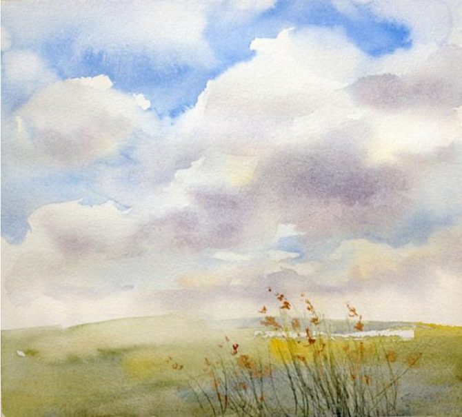
Sky is a funny thing – it’s ever changing, taking on countless shapes and colours, and playing different roles in paintings too – it can be your magnificent lead, or a humble extra.

Today we are here to teach you how to paint a beautiful sky and clouds using watercolours with a simple, step by step guide.

But first, we have some useful tips to share:

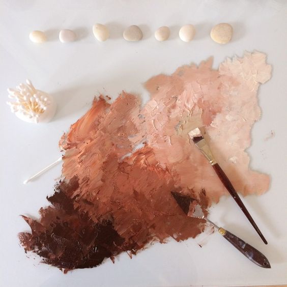
  1. Use multiple colours in your sky. Don’t limit yourself to blues – use reds and yellows as well to help balance the warm and cool tones.
  2. When using the “wet on wet” technique to paint clouds, keep in mind that the colours will lighten as they dry.
  3. Keep in mind that the closer you go to the horizon, the warmer and lighter the sky appears to be.
  4. Don’t forget about perspective when painting clouds and other three-dimensional objects and add highlights and shadows to match the direction the light is coming from. 
  5. The clouds will look more realistic if you combine sharp and soft contours. 

Now let’s get to work!

Step 1

Wet the paper and wait for it to absorb some of the water. A wet but not glossy surface is ideal.

Now use some yellow (diluted with water) to make a few large brush strokes outlining the position of the clouds. Drawing them with a pencil would have been probably easier, but the empty canvas leaves a lot of space for improvisation. If you do decide to outline them in pencil, try to keep the lines as light as possible.

You can also use watercolour pencils to outline the clouds – this way, any lines you draw will disappear as soon as you cover them with paint.

Step 2

Grab some cobalt blue and start filling in the space above the clouds. Use the flat edge of the brush to keep the strokes light and natural. 

Pay attention to your paper – if it’s too dry, the result will look too hard and sharp. Don’t worry, however – you can always use a wet brush to soften things and blur any sharp transitions.

Step 3

Continue painting the blue sky, moving under the clouds and using more diluted paint to represent the shapes of clouds far away on the horizon.

Step 4.
Now, while the paper is still wet where the clouds are, you can add some shadows with a few light strokes, mixing cobalt blue and cadmium red together to achieve a darker, purplish shade.

Step 5.

Keep adding shadows and softening the outlines using the flat side of the brush. Use swift, broad strokes to cover the remaining sky areas with a mix of cobalt blue and Naples yellow.

Step 6.
Once the sky is finished, add some details to the foreground to make the painting look finished and complete.

That’s it – just look at that pretty landscape painting you just made! If you enjoyed the process and want to learn more about drawing and painting landscapes and nature, we invite you to join our landscape painting course and see what you can do with coloured pencils, pastels, watercolours, and oil paints!

How to mix skin tones

2. February 2022

a084ed804e3a392820cc3b41074b5831

The only way to paint a realistic portrait is for the artist to use general rules and create their own special method of mixing skin tones. Continue reading to learn what is the correct ratio of different colours that will help you achieve realistic skin tones.  

If you compare skin to a white sheet of paper, you’ll see that healthy skin is a warm, beige colour. Even the palest people aren’t simply white – the paper comparison makes that much clear. 

Although white is a part of the skin tone mix, so is ochre, yellow and red cadmium or even sienna or umber shades (although the last two should be used sparsely, for shading only). To make a basic skin tone colour, you need to put a small amount of white paint on your palette, dilute it, and then add ochre, red, and yellow. 

Theoretical works of contemporary artists provide instructions for another approach to creating a skin tone mix. 

Mix six parts yellow with one part red. Keep mixing until you have a smooth, yellow-orange colour. Add a half part blue and mix – you should end up with a brown-red shade. Finally, add white paint, but keep in mind that this method is not completely universal – the amount of different paints that you will need to use depends on what you are aiming for – light or dark skin tone. 

Important things to keep in mind
There is no one perfect method to mix this or that shade of skin tone – the results are tied to the artist’s idea and the skin tone of the model.
Key aspects to keep in mind are these: women’s skin is lighter and softer than men’s; body, arms, and legs are darker than the face.

Mixing skin tones with watercolours

With watercolours, mixing skin tones is a bit easier, although at times it might feel like it’s the other way around and watercolours are more difficult to handle than oil paints. However, with watercolour, you can use the whiteness of the paper and let it show through the brush strokes instead of having to add white to your mix.

Colour order:

Grab a plastic palette and apply several drops of water. Use the tip of a soft brush to pick up a bit of red watercolour. When you add it to the water, the result will be a pale pink shade. Next, add a bit of yellow and voila, you’re ready to use your skin tone for a portrait!


Every newbie or aspiring portrait artist needs to know how to mix a realistic skin tone. You can even come up with your own skin tone mixing method once you gain some experience. Keep in mind that picking and mixing proper colours is an art in its own right since every person’s skin tone is unique. Once you learn to capture a realistic skin tone, you can dive into experimenting with surreal shades and styles.

And if you want to become a real pro, join our course – we’ll become mixing masters together!

1-2017-Ilustrace-1-45

Our newsletter!