Go to

#theory

kak_narisovat_glaza_i_brovi9

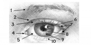
Before we begin, let’s get some anatomical terms sorted out to make sure the instructions are not confusing.

1 – Eyebrows, 2 – eyelid crease, 3 – upper eyelid, 4 – lacrimal caruncle, 5 – sclera, 6 – reflection, 7 – eyelashes, 8 – pupil, 9 – iris, 10 – lower eyelid. 


Now look at the eye drawings below, paying attention to different viewing angles. Notice how different people have very different eye shapes, eyelid sizes, and eyelashes.

Now, let’s get started! Draw two circles, one inside the other – the eyeball and the iris.

Next, add lines representing the edges of the upper and lower eyelid, then continue by adding a pupil and the edge of the face.

Use an eraser to remove the lines above and below the eye, then create the basic eyebrow shape using a few short strokes.

Next, add another line close to the upper edge of the lower eyelid – this will be the lower edge of the lower eyelid. Add an elongated drop shape below the eye, to the right, then place an oval above the eye, still to the right, and finally, add the lacrimal caruncle. Add a light reflection into the pupil as well.

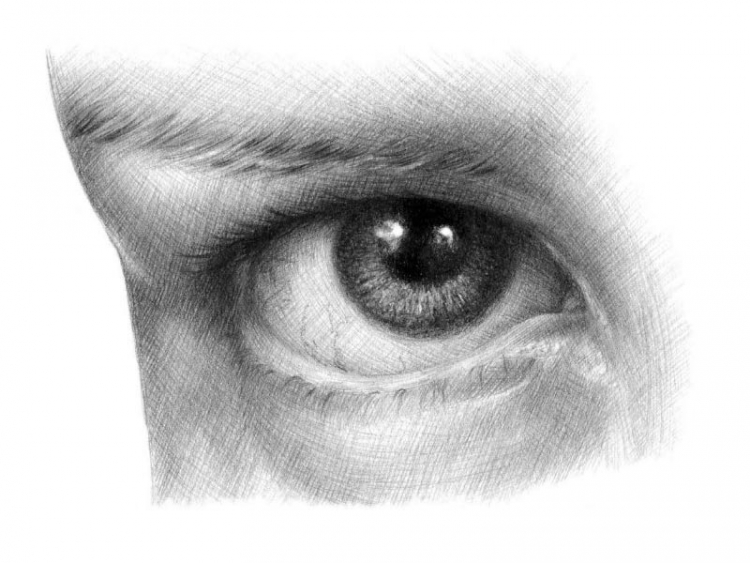
Now move on to hatching. In our model picture, the hatching shows where the darkest areas are. Pay attention to the direction of the hatching lines – they must follow the facial shapes! Use HB and 2B pencils to hatch the darkest spots, paying attention to areas with no hatching at all – these are the lightest spots in the drawing. Let’s say we’re drawing brown eyes – that means that the iris will be dark too. Use a midtone for light brown, blue, or green eyes and make sure to keep the iris very light and contrasting for light blue, light green, or grey eyes.

Now use 2H and HB pencils for cross hatching, adding volume by creating a wide range of tones, from very light to very dark, almost black. Darken the iris.

Use HB and 2B pencils to add midtones, taking time to carefully study all shadows and half-shadows. Pay extra attention to areas that have to remain light. Contrast between light and dark tones is important in drawing, adding realism and volume to your work.

Use a 2B pencil to add a shadow to the inner and outer eye corner, then use sharp 2B and HB pencils to draw an eyebrow. Next, grab a 4B and 6B pencil to shade the iris, making sure to keep some light reflections in the eye. 

If you wish, darken the areas above the eye by adding more lines to the existing hatching. Darken the eye corner and continue to work on the shading. Use an HB pencil to draw eyelashes and keep in mind that they grow from the outer edges of the eyelids. Finally, add some thin, crooked lines to represent the veins. 

Wow, this was quite a detailed tutorial, don’t you think? Still, the best way to master drawing skills is by learning from an expert 😊 Come join us at Draw Planet and sign up for our drawing course for beginners! Or perhaps we’ll see you at our portrait drawing course? Choose the one that calls to you and come learn with us!


Painting a landscape

17. February 2022

krajina2

If you love nature, being outdoors, enjoying natural scenery AND you also have an interest in painting, then landscape painting is just the right thing for you! So, how does one get started?

First thing we need to get clear is that it’s one of the more difficult fields. Don’t worry though – you’ll do great! The secret is finding the technique that suits you best and giving yourself enough time to learn and improve. You can create amazing paintings with oil, acrylics, or watercolour. And while there are hundreds of books dedicated to each one of those, today we are going to discuss some very basic principles that will help you achieve a good result.

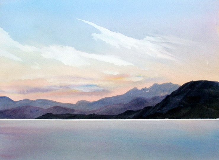
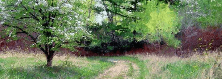
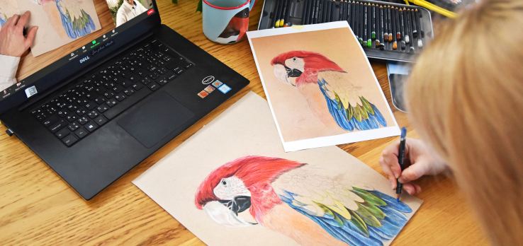
1. Pick a nice landscape for your painting

Keep in mind that not everything that looks good to you in real life will automatically make a good painting. Pick a diverse, intriguing landscape to keep your work interesting and make sure to take a photo of your chosen scene to ensure that it will look good on paper too once it becomes a solitary frame with no surroundings.

2. Take a reference picture

Take a good reference picture for you to copy while your camera is out. It’s much easier to start by copying references than diving straight into open air painting.

3. Sketch a basic outline first

Start with a basic outline, place major elements in the painting, and leave out the details – they will quickly overwhelm you if you start worrying about them right out the door. For now, focus on contrasting areas, their colour schemes, and shapes. You don’t need to painstakingly draw every single tree in the forest – hinting at them with some colour transitions is more than enough.

4. Start adding details when you are happy with the big picture

A flower in the foreground can add that little something that you feel is missing from your painting. This is also a good time to make sure that direct light is where it’s supposed to be and add highlights and shadow where needed.

5. Take another photo

Taking a photo of your work will allow you to look at it from a new perspective and compare it with your reference photo. Of course, it’s not about making a perfect copy – it’s about seeing what could be improved and taking the time to appreciate your work 😊

Landscape painting is a truly captivating affair, with amazing paintings taking you to the most beautiful places and making you feel like you really are there, inside the painting. Don’t be afraid to give it a try too – sign up for our landscape painting course, try different techniques, and learn all you need to know from our amazing, friendly teachers!

Colour mixing theory

10. February 2022

MicrosoftTeams-image

Painting is more than just applying pigment to a canvas, and the way you mix colours is just as important as your style or technique. Choosing the right shades can greatly affect the emotions conveyed by your painting – just think of Picasso’s “Blue Period” works. Would they have the same effect without those blue tones?

Whatever medium you are using, understanding and learning to mix colours properly is key. Most beginner artists tend to use only the colours that come directly out of the paint tube, but these shades are often oversaturated, flat, or simply unnatural. By learning to mix colours, you can create much more beautiful shades and save some money on top of that too since you won’t need to purchase a tube of every colour you might want to use.

To help you truly master the art of colour mixing, we put together a simple colour theory overview.


  • PRIMARY COLOURS 


The primary colours are blue, yellow, and red. All other colours are created by mixing these three together, so if you want to keep your palette minimal, primary colours are a must since you can mix any other shade using just them.


  • SECONDARY


When you mix two primary colours together, you get a secondary colour. Red and blue result in purple, blue and yellow in green and finally, red and yellow will result in orange.


  • TERTIARY 


As the name suggests, tertiary colours are created by mixing primary and secondary colours. There is a total of six tertiary colours: vermilion (red–orange), amber (yellow–orange), chartreuse (yellow–green), teal (blue-green), violet (blue–purple), and magenta (red–purple). These shades can vary, and you are free to adjust them as you see fit. For instance, you can make your vermilion more yellow and less orange by working with ratios of each composite colour.

Colours are all about ratios, and one shade can look very different depending on how you mix it. Always keep the colour wheel and each colour’s position in mind when pairing and mixing different shades. The colours that are opposite of one another on the wheel are complementary colours, which means that red and green, blue and orange, and purple and yellow will always look great together.

Colour mixing is a bit of a mysterious discipline, like alchemy, and it certainly requires a lot of practice to go with the theory. Join us at our oil painting course for beginners and learn the secrets of colour mixing with us!

https://drawplace.drawplanet.cz/kurz/kurz-kresleni-a-malovani-pro-uplne-zacatecniky/

green_m

Everyone likes a summer landscape, but for a beginner, this can be a daunting task. However, there is one important trick to keep in mind: it’s in the light that inevitably touches the green of the trees, but most people forget about it and only use two or three colours for all greenery in their landscape, ending up with a rather child-like creation. So, how do you paint a realistic green landscape?

First off, the “green” you see in the scene might actually not be green at all, even dabbling into grey-brown or carmine here and there. Let’s use works by Mark Hanson to demonstrate the principles behind painting green trees. We identified the exact shades in several spots in the painting to see what colours are really at work.

1)  The first picture shows clear shades of green that you can create using paints found in every common paint set. The beginners, however, tend to think that there is no mixing involved in these colours, which is a mistake – the bright green colours are actually rather rare in real forests. We also need to consider the painting’s circumstances – it captures the start of summer, with a bit of an overcast. The leaves are still young and at about the same distance from all objects in the painting.

2) In other seasons, however, the brightness steps aside, making space for less vibrant shades and different colours on different trees. At this time of year, you are likely to see different types of young leaves or needles, some dark like pine trees, some in cooler shades, like olive or willow trees. Different wood colours must be kept in mind as well.

3) Bright sunlight changes the painting radically. On an overcast day, the colour appears to be more or less the same across the entire treetop, but when sun comes into play, the colours in the shaded and highlighted areas are vastly different, with the light making the colours vibrant and warm and the shadow dimming and darkening them. In this picture, you can also see that the colours are different due to the distance, with the shadows on more distant trees being brighter and cooler compared to those of their neighbours.

4) The further the trees are from the viewer, the more their colour changes compared to the trees in the foreground, transitioning from green to grey. This is caused by the fog that diffuses the colour and introduces milky shades of blue and purple into the green treetops, and the more distant the object, the more fog between the object and the viewer. Just look at the rich and complex shades in this painting.

5) The colours change even more drastically once more complex lighting conditions come into play, like dusk, sunset, dawn, or darkness of the night. In such cases, all conditions that allow green to be more prominent are gone, and the trees become blue-green, grey, or even red.

Keep in mind that there isn’t a single drop of green in this picture, even though we all know that trees are green. However, our brain is used to green trees, yellow sun, and blue sky, so even when our eyes clearly paint a different picture, the brain still makes us reach for the green paint to make a green tree.

How can you “see” the colours with your mind?

There is a very simple tool that you can use. Grab a small strip of paper or cardboard and make a small hole inside it. Now place the hole over the area the colour of which you need to determine. The paper separating your spot from the rest of the scenery will help you see the colours in the hole clearly.


This little trick is especially useful when you are painting trees that are far away from the viewer – remember, the further they are, the less green they become, it’s just our brain that refuses to see it. Go ahead and try it yourself!

Get a photo of a tree or use your hole in the paper to look out the window. Try first looking at a tree like you normally would, then place your “tool” 30–50 cm away from your eyes and cover one eye with your palm. Use white paper for your “tool” and make sure it’s well-lit to ensure that your measurements are correct. Next time you decide to paint a landscape, you will already have a great method to determine if the colour you see really is green. 


Are you a nature lover? Would you like to learn to paint your own amazing landscapes? Sign up for our landscape painting course for beginners and come learn with us!


How to draw hair

5. February 2022

2e67119408d89c2ffb102b987c884e79

Drawing hair may seem daunting and difficult, but it’s really not that bad! The secret is the hair structure – unlike other head and facial elements, hair doesn’t have too many unique, defining characteristics; it only differs in colour, volume, and waviness. That’s why we will learn to draw a face actually starting with the hair before adding other features.

Real-life anatomy

Hair plays an important role in portrait construction since it makes up for a large portion of the actual head shape – and that’s why you need to be familiar with the anatomy of a skull.A skull is much like a ball, but if you just add some hair around it willy-nilly, your human will look more like a poodle-alien. To avoid this, keep in mind that a human skull is not, in fact, a perfectly round ball.

The forehead is more like a flat wall, with ears connected by temporal bones that are more airplane shaped. Only the parietal and the occipital bones are actually sphere shaped. 

Always keep the head shape in mind – regardless of the hairstyle, there is always a skull underneath it, with the hair following the skull shape or standing out, not shaping the skull.

So how do you draw hair?

Now let’s get to work and learn to actually draw some hair step by step.

First and foremost, don’t draw hair without having a base – that would be the skull. Try to define the main parts of your hair by following the skull shape and decide how the hair will be arranged geometrically. Follow the temporal (front view) or the parietal or the occipital bone (profile and three-quarter view). Pay special attention to the little curls on the forehead.

Remember that hair is much better at reflecting light than our skin and keep this in mind when shading and adding highlights and contrast. To add shading, use long, neat strokes following the shape of the head, basically adding individual hairs. Make sure you know how to properly hold a pencil to keep them nice and neat. Let’s not forget about aerial perspective too! Only the hair closest to the viewer should be visible; the hair in the background will usually merge into a single body. To achieve this effect, simply use a piece of paper to blend out your strokes. When you feel confident about being able to follow the rules above, go ahead and dive into your first hairstyle!

Pencil

Let’s go back to the top of the head for a moment. There is a secret you need to know – you can do all of the above without a model or a reference picture since all heads are built following the same set of rules.

Try and see it for yourself – get yourself a life model (with hair, obviously – bald models won’t do here) who is ready to be immortalized on paper and compare the scheme to what you see. 

Now let’s find the frontal eminences (two rounded elevations on the frontal bone of the skull) – they are usually located at the intersection point of the upper row of the square we used to draw the face in and the vertical sides between the eyes and the ears (closer to the ears). These points mark the zones between the eyes and ears (the frontal and the parietal zone).

You will also need to determine the height of your hairstyle – go ahead and draw the shape of each zone, keeping the added distance in mind.

Now add detail to hair strands around the forehead and give them the desired shape, then move on to shading when you feel like your hair construction is done. Start from the darkest areas (shadows and cast shadows), then move on to midtones and finish with highlights.

Here’s a useful little trick for you: grab a rectangular eraser and cut it across, creating two triangle pieces – now you have two erasers with fine tips to comfortably erase the smallest lines and add gentle highlights and glowing spots of light!

Highlight the hairs in the front with bold, confident strokes and add any hair that is not on the parietal plane around the edges. 

Are you intrigued and ready to start? Dive straight into it, and if you want to learn from the best, sign up for one of our courses! We suggest taking a look at our portrait drawing course to really master hair with ease and confidence.


Watercolour pros and cons

3. February 2022

carissa-weiser-oPI3Oxj_cEw-unsplash

What makes watercolours so popular?

First off, they can be easily diluted with, you know, water, making a transition from one colour to the next practically invisible, creating a cool, transparent, smoky effect that is impossible to achieve with thicker materials like oil paint.

They are also ready to be used immediately, there is no need to make any preparations like thinning them down – just wet your brush and you are good to go. Combining colours or mixing a desired shade is also simple, and kids can also work with watercolours easily and comfortably.

Another great thing about watercolours is that they are non-toxic and odourless. They are also rather inexpensive, and you can use any paper that you have on hand, although you do need a special textured paper for the best results.

What makes watercolours not so great?

The main cons of watercolours are closely tied to their greatest pros. Paint transparency, one of the most praised properties of watercolours, makes it almost impossible to hide or correct mistakes. Furthermore, the colours do fade to a certain degree once the paint dries, causing a bit of a headache to beginner artists. 

Another downside is that you need to wait for one layer to dry completely before you can add another – otherwise you risk ruining your entire work.

Finally, there’s paper deformation – since watercolours are applied with a very wet brush, your paper is bound to get wrinkled to a certain degree. 

Don’t get discouraged though! You can easily learn to work with the downsides of watercolours – join our watercolour course to learn how! We promise that our amazing teachers will guide you to success 😊


How to draw a tree

3. February 2022

как-рисовать-деревья-20

One would think that a tree is one of the simplest things you can draw…but if you have never been too much into drawing, chances are your tree will end up looking too simplistic…


… or too detailed.


Neither of these two pictures resembles a real tree – the first is more like a symbol, while the other is more of a definition of a tree. But as an artist, your main task is to capture what you see, not what you know, and drawing trees is a great way to practice this.

In this blog post, we’ll teach you to draw a very realistic oak tree using a very simple method.

You will need:
–  a couple of sheets of paper;
– an HB pencil;
– a medium-soft pencil (2B);
– a soft pencil (5B);
– a pencil sharpener.

You can also make do with a couple of hard HB pencils, but they are not versatile enough to be used in any type of drawing – you need soft pencils to create rich, dark shadows, something you can’t achieve with hard pencils, no matter how hard you push.

Make sure to have a pencil sharpener handy as well – a blunt tip creates lighter and blurrier strokes that don’t match the expected result. Keep your pencils sharp and keep in mind that soft pencils blunt faster than hard pencils!

As for the paper, you don’t need anything too fancy – simple printer paper will do. Don’t make your drawing too big either – the smaller the picture, the less detail you need to add. For reference, the drawings you see in this article are only 9 cm tall.

Our brain works in a curious manner – it notices an entire object first and starts paying attention to details next. And that is why you don’t need to start creating your drawing from the details – you need a base first.

Step 1

Use a couple of very light strokes and dots to outline a simple tree shape. Use a harder pencil (HB) and don’t apply too much pressure – these strokes will not be a part of your finished drawing.

Step 2

Draw a trunk, making it wider at the bottom and narrower at the top. The bigger the tree, the shorter and wider the trunk.

Step 3

Add branches to the upper part of the tree. Keep in mind that tree branches gradually lower down as they grow and make sure to capture that as well.

Step 4

Draw smaller branches growing out of the large branches. The longer the branch, the lower the splitting begins. Keep your strokes light.

Step 5

Use short, quick strokes to outline the treetop and don’t make it too even.

Step 6

Draw the little leaf “clouds” in the treetop with the same short, quick strokes. Leave some areas empty to make some branches visible and make your drawing more lifelike.

Step 7

Make the branches thicker where there are no leaves covering them.

Step 8

Before you start shading, decide which part of the tree will be turned towards the light and where the shadows will be. You can outline them with simple hatching.

Step 9

Use a soft, sharp pencil (2B) to add texture to the trunk, leaving some white parts to capture the bark texture properly.

Step 10

Use soft pencils (2B, 5B) to darken the trunk, keeping in mind where you decided to put your light source and the corresponding light/shadow distribution. Don’t be afraid to apply more pressure to a soft pencil to get a deeper shadow but be careful to not overdo it. The fewer black areas you’ll have in the picture, the more realistic and impressive it’ll look.

Step 11

Grab a hard pencil and add leaf shapes by drawing relaxed, loose circles with quick, sharp movements.

Step 12

Every branch has its own little “treetop” (remember those “clouds” you drew?). Draw them as if they all were small separate trees. 

First grab a soft pencil (2B) and use it to make darker circles on the darker side of the tree. Don’t apply too much pressure at first to make it easier to correct potential mistakes. 

When you are sure that you have determined where your shadows will be correctly, add the shadows and depth, creating a transition between the dark and light parts.

Step 13

Use a soft pencil (2B) to add a couple of more pronounced leaves to the entire treetop and each individual “mini treetop” to create an illusion of more barely visible small branches.

Step 14

Now use the softest pencil you have to add a few dark accents to the darkest areas of the tree as well, creating more contrast in the treetop. Make sure that all leaves are darker than the “sky” (your background) – no leaves should appear transparent! Go over the light areas with a hard pencil one more time if necessary. 

So, drawing a tree wasn’t that hard, was it? All you need to do is capture their real appearance, not a definition of a tree from a dictionary. But this is just the start of your practice – if you want to become really good at drawing trees, make it a habit to carry a sketchbook with you when you go for a walk, look at the trees around you and try to capture them with quick sketches.

Do you love nature? We do for sure, which is why we have an entire course on painting and drawing landscapes at Draw Planet! Learn to work with pastels, coloured pencils, watercolours and oil paints, all the while creating amazing pictures of beautiful flora 😊

Drawing hands

3. February 2022

MultAXn

There seems to be a consensus among artists that hands are the most difficult thing to draw, with every artist having their own slightly shameful examples of hiding the hands of their characters inside their pockets or behind their backs just to avoid having to draw them. It is, therefore, rather ironic that we always carry the best model one could wish for with us, and right in front of us most of the time – our own hands. Using a mirror and a little effort, we can learn to draw hands in basically any position, from any angle. The only catch here is the fact that hands are very complex tools with many joints and other small details that often leave us at a loss and unable to decide where we even start.

The easiest way to draw a hand is to start with the palm – it should look like a round, rectangular or trapeziform steak with rounded corners, with fingers connected to it.

Now, if you have trouble drawing fingers, think of every finger as a series of interconnected cylinders – this should help you draw fingers from any angle. Just look at the picture below – cylinder edges become the lines where the fingers bend at the joints.

Don’t forget about fingernails either and learn to understand when you do and when you don’t need to draw them. As a general rule, only draw fingernails when the hand is close to the viewer and needs a lot of detail.

Overall, hands are very different and individual, just like faces. Men’s hands are different from women’s hands, old hands look different compared to young hands, and so on. You can see examples of some hand types below, but these are just a few examples of many, and in no way is this a representation of the whole range of hand diversity. When it comes to hand variety and differences, you’ll find that hands do have their own character too. 

-Different finger to palm ratios

-Finger shapes

To make matters even more complicated, fingernails are very different person to person as well! And even if the nail bed is the same size, manicure can still make them different.


Simple exercise
Examine your hands and the hands of other people. How are the fingers arranged? What are the differences between men’s and women’s hands? What about your grandma’s hands and your hands? Can you recognize your friends just by their hands? Sketch hands that you see around you or use referenceimages instead. Don’t worry about ratios – focus on capturing what the hands are doing. Try drawing your own hands in different positions, use a mirror to see them from different angles and views, always starting your drawing from the simplest shapes. You can also start with quick, energetic sketches and add details to them later.

Come join our figure drawing course and learn to capture the hands of live models (and much more) with our amazing teachers. We look forward to seeing you!


Jacksons_Tones_Atmos-1024×683

Every skin tone contains three basic colours – blue, red, and yellow – in different ratios depending on how light or dark the skin is, whether it’s in the shadow or out in the light, and also depending on the body part. For instance, thin skin, like that on your temples, tends to carry cooler shades while the tip of the nose is usually darker. The first thing to keep in mind is that there is no magic recipe to create the perfect, universal skin tone – you will have to learn to mix your own skin tones, and that’s where the colour ratios come into play.

Now that we’ve established how different skin tones are, our next piece of advice is to avoid those paint tubes with “universal skin tone”. You could use them as a base for mixing the shades you really need for your portrait, but since these pre-mixed skin tones are just a basic mix of blue, yellow, and red, there is no reason why you can’t do that yourself.

A simple mixing method

Start by mixing the same amount of each basic colour together – this will result in a brownish colour, a base that you will lighten and darken, make it warmer or cooler.

Note: if you get more of a greenish colour, simply add more red to balance it out since some paints and colours can be more dominant than others.

In portrait painting, just like in landscapes, your best bet is to try to capture the colour you see as closely as possible. Take a good look at the colour on your model picture or your live model’s body and try to create the same shade on your palette, comparing it to your model as you go to fine-tune and perfect it. Think of these questions as you work towards that perfect shade.

  1. Do I need a lighter or a darker shade? If the answer is lighter, add yellow or white. The white will also make the shade cooler and more coating, while the yellow will add warm undertones. Use dark ochres, rusty shades (like burnt umber) or chromatic blacks (like burnt sienna combined with ultramarine blue) to make your mix darker.
  2. Do I need a cooler or a warmer shade? Add blue (or white to simultaneously lighten the mix) to make your shade cooler. Use yellow or warm red to add warmth to your skin tone mix.
  3. Do I need to make my skin tone more or less saturated? Use the opposite colour to balance things out.

You can also use earthy colours like ochre, rust, or black shades, but keep in mind that even these can be created by mixing the three basic colours together. In the end, it’s up to you to decide what mix works best for you.

An example palette

Let’s take  a look at some colours that you can start with and then add, remove, or change colours on your palette to your liking.

  1. Titanium White
  2. Cadmium Red Light
  3. Cadmium Yellow Medium
  4. Ochre
  5. Burnt Sienna
  6. Burnt Umber
  7. Ultramarine Blue

For light skin tones, use a mix of 1, 2, 3, and 5.

For medium tones, use 2, 3, 4, and 5.

For dark skin tones, use 2, 5, 6, and 7.

Create a series of different shades for different colours that you use – for instance, keep adding more and more white to Cadmium Red, creating a variety of shades available to you. Do the same for your skin tone mixes to create a perfect dark-to-light palette to use for adding shadows and highlights to your portrait without having to mix a new shade from scratch every time.

A tip to get you started in skin tone mixology

Start by looking at your own skin and try to mix shades that match your hands. Take note of how different colours and shades look depending on different lighting and light sources. Next, try to mix a shade that matches your face, examining the colours and different shades you see in the mirror. Then, try to mix them from memory. Printing out pictures of people and trying to mix a shade to match their skin is also a great way to practice. Also, did you notice that not once did we use orange or pink  like we used to do as kids? 😊 

Want to learn more and become a real pro? Join us at our portrait drawing and painting course. We look forward to meeting you!

How to mix skin tones

2. February 2022

a084ed804e3a392820cc3b41074b5831

The only way to paint a realistic portrait is for the artist to use general rules and create their own special method of mixing skin tones. Continue reading to learn what is the correct ratio of different colours that will help you achieve realistic skin tones.  

If you compare skin to a white sheet of paper, you’ll see that healthy skin is a warm, beige colour. Even the palest people aren’t simply white – the paper comparison makes that much clear. 

Although white is a part of the skin tone mix, so is ochre, yellow and red cadmium or even sienna or umber shades (although the last two should be used sparsely, for shading only). To make a basic skin tone colour, you need to put a small amount of white paint on your palette, dilute it, and then add ochre, red, and yellow. 

Theoretical works of contemporary artists provide instructions for another approach to creating a skin tone mix. 

Mix six parts yellow with one part red. Keep mixing until you have a smooth, yellow-orange colour. Add a half part blue and mix – you should end up with a brown-red shade. Finally, add white paint, but keep in mind that this method is not completely universal – the amount of different paints that you will need to use depends on what you are aiming for – light or dark skin tone. 

Important things to keep in mind
There is no one perfect method to mix this or that shade of skin tone – the results are tied to the artist’s idea and the skin tone of the model.
Key aspects to keep in mind are these: women’s skin is lighter and softer than men’s; body, arms, and legs are darker than the face.

Mixing skin tones with watercolours

With watercolours, mixing skin tones is a bit easier, although at times it might feel like it’s the other way around and watercolours are more difficult to handle than oil paints. However, with watercolour, you can use the whiteness of the paper and let it show through the brush strokes instead of having to add white to your mix.

Colour order:

Grab a plastic palette and apply several drops of water. Use the tip of a soft brush to pick up a bit of red watercolour. When you add it to the water, the result will be a pale pink shade. Next, add a bit of yellow and voila, you’re ready to use your skin tone for a portrait!


Every newbie or aspiring portrait artist needs to know how to mix a realistic skin tone. You can even come up with your own skin tone mixing method once you gain some experience. Keep in mind that picking and mixing proper colours is an art in its own right since every person’s skin tone is unique. Once you learn to capture a realistic skin tone, you can dive into experimenting with surreal shades and styles.

And if you want to become a real pro, join our course – we’ll become mixing masters together!

IMG_7051

Our newsletter!