Colour mixing theory
10. February 2022
Back to blog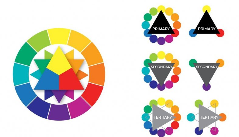
Painting is more than just applying pigment to a canvas, and the way you mix colours is just as important as your style or technique. Choosing the right shades can greatly affect the emotions conveyed by your painting – just think of Picasso’s “Blue Period” works. Would they have the same effect without those blue tones?
Whatever medium you are using, understanding and learning to mix colours properly is key. Most beginner artists tend to use only the colours that come directly out of the paint tube, but these shades are often oversaturated, flat, or simply unnatural. By learning to mix colours, you can create much more beautiful shades and save some money on top of that too since you won’t need to purchase a tube of every colour you might want to use.
To help you truly master the art of colour mixing, we put together a simple colour theory overview.
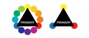
- PRIMARY COLOURS
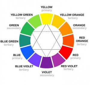
The primary colours are blue, yellow, and red. All other colours are created by mixing these three together, so if you want to keep your palette minimal, primary colours are a must since you can mix any other shade using just them.
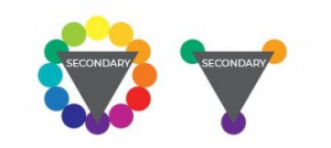
- SECONDARY
When you mix two primary colours together, you get a secondary colour. Red and blue result in purple, blue and yellow in green and finally, red and yellow will result in orange.
- TERTIARY
As the name suggests, tertiary colours are created by mixing primary and secondary colours. There is a total of six tertiary colours: vermilion (red–orange), amber (yellow–orange), chartreuse (yellow–green), teal (blue-green), violet (blue–purple), and magenta (red–purple). These shades can vary, and you are free to adjust them as you see fit. For instance, you can make your vermilion more yellow and less orange by working with ratios of each composite colour.

Colours are all about ratios, and one shade can look very different depending on how you mix it. Always keep the colour wheel and each colour’s position in mind when pairing and mixing different shades. The colours that are opposite of one another on the wheel are complementary colours, which means that red and green, blue and orange, and purple and yellow will always look great together.
Colour mixing is a bit of a mysterious discipline, like alchemy, and it certainly requires a lot of practice to go with the theory. Join us at our oil painting course for beginners and learn the secrets of colour mixing with us!
https://drawplace.drawplanet.cz/kurz/kurz-kresleni-a-malovani-pro-uplne-zacatecniky/