Go to

#landscape

Painting a landscape

17. February 2022

krajina2

If you love nature, being outdoors, enjoying natural scenery AND you also have an interest in painting, then landscape painting is just the right thing for you! So, how does one get started?

First thing we need to get clear is that it’s one of the more difficult fields. Don’t worry though – you’ll do great! The secret is finding the technique that suits you best and giving yourself enough time to learn and improve. You can create amazing paintings with oil, acrylics, or watercolour. And while there are hundreds of books dedicated to each one of those, today we are going to discuss some very basic principles that will help you achieve a good result.

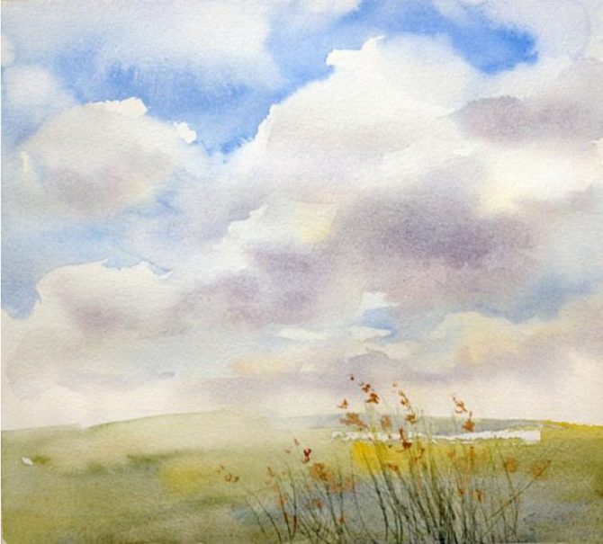
1. Pick a nice landscape for your painting

Keep in mind that not everything that looks good to you in real life will automatically make a good painting. Pick a diverse, intriguing landscape to keep your work interesting and make sure to take a photo of your chosen scene to ensure that it will look good on paper too once it becomes a solitary frame with no surroundings.

2. Take a reference picture

Take a good reference picture for you to copy while your camera is out. It’s much easier to start by copying references than diving straight into open air painting.

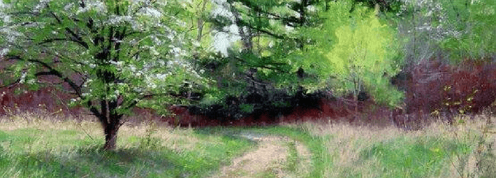
3. Sketch a basic outline first

Start with a basic outline, place major elements in the painting, and leave out the details – they will quickly overwhelm you if you start worrying about them right out the door. For now, focus on contrasting areas, their colour schemes, and shapes. You don’t need to painstakingly draw every single tree in the forest – hinting at them with some colour transitions is more than enough.

4. Start adding details when you are happy with the big picture

A flower in the foreground can add that little something that you feel is missing from your painting. This is also a good time to make sure that direct light is where it’s supposed to be and add highlights and shadow where needed.

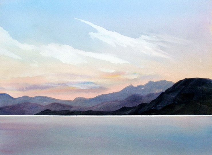
5. Take another photo

Taking a photo of your work will allow you to look at it from a new perspective and compare it with your reference photo. Of course, it’s not about making a perfect copy – it’s about seeing what could be improved and taking the time to appreciate your work 😊

Landscape painting is a truly captivating affair, with amazing paintings taking you to the most beautiful places and making you feel like you really are there, inside the painting. Don’t be afraid to give it a try too – sign up for our landscape painting course, try different techniques, and learn all you need to know from our amazing, friendly teachers!

Painting sky with watercolours

13. February 2022

3-7-670×605

Sky is a funny thing – it’s ever changing, taking on countless shapes and colours, and playing different roles in paintings too – it can be your magnificent lead, or a humble extra.

Today we are here to teach you how to paint a beautiful sky and clouds using watercolours with a simple, step by step guide.

But first, we have some useful tips to share:

  1. Use multiple colours in your sky. Don’t limit yourself to blues – use reds and yellows as well to help balance the warm and cool tones.
  2. When using the “wet on wet” technique to paint clouds, keep in mind that the colours will lighten as they dry.
  3. Keep in mind that the closer you go to the horizon, the warmer and lighter the sky appears to be.
  4. Don’t forget about perspective when painting clouds and other three-dimensional objects and add highlights and shadows to match the direction the light is coming from. 
  5. The clouds will look more realistic if you combine sharp and soft contours. 

Now let’s get to work!

Step 1

Wet the paper and wait for it to absorb some of the water. A wet but not glossy surface is ideal.

Now use some yellow (diluted with water) to make a few large brush strokes outlining the position of the clouds. Drawing them with a pencil would have been probably easier, but the empty canvas leaves a lot of space for improvisation. If you do decide to outline them in pencil, try to keep the lines as light as possible.

You can also use watercolour pencils to outline the clouds – this way, any lines you draw will disappear as soon as you cover them with paint.

Step 2

Grab some cobalt blue and start filling in the space above the clouds. Use the flat edge of the brush to keep the strokes light and natural. 

Pay attention to your paper – if it’s too dry, the result will look too hard and sharp. Don’t worry, however – you can always use a wet brush to soften things and blur any sharp transitions.

Step 3

Continue painting the blue sky, moving under the clouds and using more diluted paint to represent the shapes of clouds far away on the horizon.

Step 4.
Now, while the paper is still wet where the clouds are, you can add some shadows with a few light strokes, mixing cobalt blue and cadmium red together to achieve a darker, purplish shade.

Step 5.

Keep adding shadows and softening the outlines using the flat side of the brush. Use swift, broad strokes to cover the remaining sky areas with a mix of cobalt blue and Naples yellow.

Step 6.
Once the sky is finished, add some details to the foreground to make the painting look finished and complete.

That’s it – just look at that pretty landscape painting you just made! If you enjoyed the process and want to learn more about drawing and painting landscapes and nature, we invite you to join our landscape painting course and see what you can do with coloured pencils, pastels, watercolours, and oil paints!

green_m

Everyone likes a summer landscape, but for a beginner, this can be a daunting task. However, there is one important trick to keep in mind: it’s in the light that inevitably touches the green of the trees, but most people forget about it and only use two or three colours for all greenery in their landscape, ending up with a rather child-like creation. So, how do you paint a realistic green landscape?

First off, the “green” you see in the scene might actually not be green at all, even dabbling into grey-brown or carmine here and there. Let’s use works by Mark Hanson to demonstrate the principles behind painting green trees. We identified the exact shades in several spots in the painting to see what colours are really at work.

1)  The first picture shows clear shades of green that you can create using paints found in every common paint set. The beginners, however, tend to think that there is no mixing involved in these colours, which is a mistake – the bright green colours are actually rather rare in real forests. We also need to consider the painting’s circumstances – it captures the start of summer, with a bit of an overcast. The leaves are still young and at about the same distance from all objects in the painting.

2) In other seasons, however, the brightness steps aside, making space for less vibrant shades and different colours on different trees. At this time of year, you are likely to see different types of young leaves or needles, some dark like pine trees, some in cooler shades, like olive or willow trees. Different wood colours must be kept in mind as well.

3) Bright sunlight changes the painting radically. On an overcast day, the colour appears to be more or less the same across the entire treetop, but when sun comes into play, the colours in the shaded and highlighted areas are vastly different, with the light making the colours vibrant and warm and the shadow dimming and darkening them. In this picture, you can also see that the colours are different due to the distance, with the shadows on more distant trees being brighter and cooler compared to those of their neighbours.

4) The further the trees are from the viewer, the more their colour changes compared to the trees in the foreground, transitioning from green to grey. This is caused by the fog that diffuses the colour and introduces milky shades of blue and purple into the green treetops, and the more distant the object, the more fog between the object and the viewer. Just look at the rich and complex shades in this painting.

5) The colours change even more drastically once more complex lighting conditions come into play, like dusk, sunset, dawn, or darkness of the night. In such cases, all conditions that allow green to be more prominent are gone, and the trees become blue-green, grey, or even red.

Keep in mind that there isn’t a single drop of green in this picture, even though we all know that trees are green. However, our brain is used to green trees, yellow sun, and blue sky, so even when our eyes clearly paint a different picture, the brain still makes us reach for the green paint to make a green tree.

How can you “see” the colours with your mind?

There is a very simple tool that you can use. Grab a small strip of paper or cardboard and make a small hole inside it. Now place the hole over the area the colour of which you need to determine. The paper separating your spot from the rest of the scenery will help you see the colours in the hole clearly.


This little trick is especially useful when you are painting trees that are far away from the viewer – remember, the further they are, the less green they become, it’s just our brain that refuses to see it. Go ahead and try it yourself!

Get a photo of a tree or use your hole in the paper to look out the window. Try first looking at a tree like you normally would, then place your “tool” 30–50 cm away from your eyes and cover one eye with your palm. Use white paper for your “tool” and make sure it’s well-lit to ensure that your measurements are correct. Next time you decide to paint a landscape, you will already have a great method to determine if the colour you see really is green. 


Are you a nature lover? Would you like to learn to paint your own amazing landscapes? Sign up for our landscape painting course for beginners and come learn with us!


1-2017-Akvarelova-Ilustrace-1-94

Our newsletter!