Go to

Draw Place Blog

How to mix skin tones

2. February 2022

a084ed804e3a392820cc3b41074b5831

The only way to paint a realistic portrait is for the artist to use general rules and create their own special method of mixing skin tones. Continue reading to learn what is the correct ratio of different colours that will help you achieve realistic skin tones.  

If you compare skin to a white sheet of paper, you’ll see that healthy skin is a warm, beige colour. Even the palest people aren’t simply white – the paper comparison makes that much clear. 

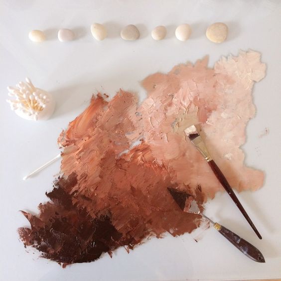
Although white is a part of the skin tone mix, so is ochre, yellow and red cadmium or even sienna or umber shades (although the last two should be used sparsely, for shading only). To make a basic skin tone colour, you need to put a small amount of white paint on your palette, dilute it, and then add ochre, red, and yellow. 

Theoretical works of contemporary artists provide instructions for another approach to creating a skin tone mix. 

Mix six parts yellow with one part red. Keep mixing until you have a smooth, yellow-orange colour. Add a half part blue and mix – you should end up with a brown-red shade. Finally, add white paint, but keep in mind that this method is not completely universal – the amount of different paints that you will need to use depends on what you are aiming for – light or dark skin tone. 

Important things to keep in mind
There is no one perfect method to mix this or that shade of skin tone – the results are tied to the artist’s idea and the skin tone of the model.
Key aspects to keep in mind are these: women’s skin is lighter and softer than men’s; body, arms, and legs are darker than the face.

Mixing skin tones with watercolours

With watercolours, mixing skin tones is a bit easier, although at times it might feel like it’s the other way around and watercolours are more difficult to handle than oil paints. However, with watercolour, you can use the whiteness of the paper and let it show through the brush strokes instead of having to add white to your mix.

Colour order:

Grab a plastic palette and apply several drops of water. Use the tip of a soft brush to pick up a bit of red watercolour. When you add it to the water, the result will be a pale pink shade. Next, add a bit of yellow and voila, you’re ready to use your skin tone for a portrait!


Every newbie or aspiring portrait artist needs to know how to mix a realistic skin tone. You can even come up with your own skin tone mixing method once you gain some experience. Keep in mind that picking and mixing proper colours is an art in its own right since every person’s skin tone is unique. Once you learn to capture a realistic skin tone, you can dive into experimenting with surreal shades and styles.

And if you want to become a real pro, join our course – we’ll become mixing masters together!

plongee

The face is the first thing we humans notice and pay attention to, and the ability to capture the face, emotions, and facial expressions on paper is definitely an important one. In this article, we will discuss the key aspects of drawing a face – proportions, features, and angles.

Facial proportions

En face (front view)
From this point of view, the skull looks like a circle with the jawline attached to it. Together, they create a shape of an egg with the narrow end pointed down. Two perpendicular lines meet in the centre of the “egg”, dividing it into four parts.

Feature placement:

Find the centre of the left and the right half of the horizontal line. This is where the eyes are.
Divide the bottom part of the vertical line into five equal parts. The nose tip is at the second point from the centre down. The mouth line is the third point, just below the nose tip. 

Divide the upper part of the vertical line into four equal parts. The hairline (unless your character is bald) is between the second and third point moving from the centre. Ears are framed by the upper eyelid and the nose tip (if the person you are drawing is looking straight ahead). If the person looks up or down, the ear position will change.

A good tip to remember: The face is roughly five eyes wide (or a bit less). The space between the eyes is equal to the size of an eye – that’s why you can always tell when someone’s eyes are unusually close or far apart. When the eyes are further apart, it makes the person look childlike and innocent, while eyes that are close together usually make people look suspicious. The distance between the chin and the lower edge of the mouth is equal to the size of an eye as well.

Profile (side view)

From the side, the head shape resembles an egg as well, with the tip pointed downward with a slight slant this time. The central lines now divide the head into the front (facial) and back (skull) part.

Skull:

The ear is right behind the central line. Depending on the size and placement, it is framed by the upper lid and the nose tip as well.

Face:

The facial details are placed just as in the front view.
The nose bridge dip either matches the central line or is slightly above it.
The brow line is the most prominent part (one point upwards from the centre).

Time to practice!

Use the quick sketching method and practice drawing facial expressions of people around you – look at the people on the street or in a café, for instance. Don’t try to capture every detail and don’t be afraid of making mistakes – the key thing is to capture the main characteristics of different expressions from different angles.

If you find it difficult to capture volume, grab a real egg (and make sure it’s cooked, just in case – you don’t want to make a mess) and draw the lines we mentioned above right on the egg. Then examine the egg from different angles and observe how the distance between individual lines changes. You can even draw some basic facial features on the egg, following the guiding lines, and observe them too.

And if you want to really master capturing facial expressions don’t fret, we have a course for that! Join us at Draw Planet and register for our portrait drawing course where you will also try your hand at different media, like pastels or oil paint 😊


How to use acrylics

1. February 2022

Bez názvu-rrrrr

Have you been painting for some time now and decided that it was time for something new? Acrylics should be right on your radar! Thanks to their plastic base, acrylics give paintings an interesting volume and structure, while using them isn’t any more difficult than using watercolour. Finished paintings don’t need to be fixed – acrylics maintain their bright colours, are waterproof, and long-lasting.

1. Acrylics – what are they?

2. How to create a base for your painting

3. Learn to paint with acrylics

4. Useful tips and tricks


Acrylics – what are they?

Acrylics entered mass production rather recently, some 50 years ago. Thanks to their versatility and long life, pigmented acrylic resin quickly gained popularity and today, it’s used by painters, but also by interior artists who use them to create murals, or even builders and manicurists.

There are different types of acrylics, too. You would be wise to choose special, thick acrylics to decorate a wall or a ceiling since they can add volume and bring colour, realism, and a unique touch to the interior décor. For traditional canvas painting, less concentrated paints work better, and you can usually buy them in tubes. Working with acrylics is especially fascinating for beginners who can use them to discover their artistic abilities step by step.

How to create a base for your painting

Before you run to grab your paints, you need to make some basic preparations. You can use a wooden board or plywood as your canvas or go for a traditional canvas as well. You can also use paper, which is the best option for beginners who have just started working with acrylics.

Make sure to get thick paper with a rough surface – you will need a firm surface to apply acrylic paint properly, so make sure to tape your textured paper to a wood board if that is your canvas of choice.

Use a book to remove any air bubbles and voila, your canvas is ready! If you decide to make our own wood frame canvas, you will have to sand it first because acrylics do best on a smooth surface. Beginners often wonder what kind of a surface is hidden beneath the acrylic paint.

If you decide to go for boards instead of canvas, you will need to apply a base layer of acrylic paint that you can buy in any art supplies store. It’s a special emulsion with titanium dioxide that works as a whitener. Apply several layers of this primer to your board and let it dry for a day.


Learn to paint with acrylics

Before you begin, make sure your paints haven’t dried out and keep the palette with your paint wet when you apply the first strokes. A spray bottle is a handy tool to have since you don’t need to pour a ton of water on the acrylics at once. Use an absorbing paper – placing it under your palette is a smart idea.

Check how transparent or opaque your paint is – the more water you use, the more transparent the strokes will be. Use the large brushes first and start with big, broad areas, then make your way to smaller brushes and details. Painting with acrylics on paper or wood board requires total concentration and precision. Use a mirror to check your work’s proportions from time to time.

Beginners often have trouble mixing acrylics. You can dilute your paints a bit more before mixing – this way, the colours will stay “open” longer, which makes it easier to achieve the desired result. Make sure to only use the tip of your brush. To get a clear contour, you can use masking tape or painter’s tape that you can easily buy at any hardware store.

If you need to lighten or darken a colour, try adding white or black. To clean a palette that was used for acrylics, use any solvent suitable for acrylics.


Useful tips and tricks

Applying acrylics to wood or paper is a fun creative process full of surprises. Here are some tips and tricks for you to make it even more fun and encounter fewer unpleasant surprises.

The colours will darken significantly once dry, so keep that in mind when you’re choosing them. Use non-toxic materials – they are more expensive, but they are worth it. Don’t forget to wear an apron to protect your clothes. 

Apart from professional brushes with long handles, paints, and canvas primers, consider also getting some decoupage glue and a spray bottle to fill with water.

When choosing a palette, opt for a plastic one – it’s practical and easy to clean. Don’t forget to always have a cup of clean water nearby to rinse and wet your brushes.

Once mastered, acrylics offer immense possibilities and you can create all sorts of masterpieces! Patience, practice, and the right supplies are the key to impressive results.

Would you like to try working with acrylics? Come to Draw Planet and join our acrylics course. Together, we can do it!


How to draw a horse

1. February 2022

kak_narisovat_loshad

Can you draw a horse by following a certain set of steps? We’re about to find out!

Step 1

Draw a small circle and make sure to place it in the upper left part of your canvas. This will be our horse’s head, although it doesn’t look like much now.

Step 2

Add a flowerpot-shaped object to the lower left part of the “head”. Try placing it just like we did in our step-by-step drawing.

Step 3

Now let’s give our horse a neck. Draw a rounded shape and attach it to the upper and lower part of the circle. Pay attention to how smooth the shape is and how it widens as it goes down.

Step 4

Now we’re getting to the fun part, the body. Draw two circles and place them in the same horizontal plane. Make the first circle bigger and the second one smaller. Pay attention to where their centre is – it’s not on the same plane! The smaller circle attaches to the bigger circle, but their imaginary centres don’t line up.

Step 5

Now we’ll add the leg shapes. Front legs are like long cylinders that narrow slightly as they go down before widening slightly again right at the bottom, at the hooves. The hind legs have an extra bend where the thigh and the shin meet. The bend is much more pronounced in the hind leg in the background, farthest from us.

Step 6

Wow look at us go!

In this step, we’ll add an eye contour (place the eye very close to the line inside the circle, the one that represents the top of the “flowerpot”) and ear contours as well (by attaching two triangles at the top of the head). Finally, we’ll add the nostrils and the mouth.

Step 7

Now erase the extra lines from the previous steps to “clean” the drawing.

Step 8

It would be a pretty strange horse without a tail and mane, wouldn’t it? On the forehead, the mane looks like a fringe, while on the back it resembles long hair. The key rule here is to always draw the hairs in the mane or tail in the same direction as they grow, from roots to ends.

Step 9

Now let’s add some light shading. Don’t forget about a big shadow on the inside of the back hind leg. We also need to add a shadow on the ground below the horse to prevent it from looking like it’s levitating.

Join our drawing course for beginners to learn to draw things step by step, from the very basics. Sign up and master shading, hatching, and much more!


25. September 2017

4zpUGcRjI8U

Topics

IMG_7051

Our newsletter!