Go to

Draw Place Blog

Drawing emotions

4. February 2022

sQiDbZM

There are millions of eyes, ears, mouths, and chins around the world, and each of them is unique. However, they share some basic features that you need to get down to draw nice faces. And if you want to make your drawings even better, you need to learn to capture emotions and facial expressions.

Anyone can draw a face, really – you can simply draw a circle with two dots for the eyes and a couple of lines for mouth and nose and call it a face. Yet despite the simplicity of the basic facial construction, most people struggle when it comes to drawing emotions.

What does a face do?

You can change your facial expression as easily as you can change the tone of your voice. One thing that we must understand is that facial expressions are not created just by muscle contraction – it’s a combination of some muscles contracting and some relaxing, and in some cases, like a smile and a laugh, the only difference is in the contraction intensity.

Basic emotions

Basic (primary) emotions are those that we can’t fully control – they manifest themselves automatically, with not much control from us. A basic emotion can happen out of the blue, for instance, when you instinctively react to an impulse.

These primary emotions express themselves universally, regardless of culture, race, or age. So which emotions are primary? Here are a few examples:

1. Happiness: corners of the mouth are pointing up, brows are raised, eyes are open.
2. Anger: corners of the mouth are pointing down, brows are wrinkled towards the nose bridge, eyes are open.
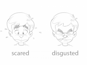
3. Fear: the mouth is curved with corners pointing down, the brows are pointing up, eyes are open.
4.  Sadness: corners of the mouth are pointing down, brows are slightly raised around the nose bridge, eyes are narrowed, gaze is down.


These are the four facial expressions that we use most often. We can use the drawings of these four emotions to derive what other emotions will look like on paper.

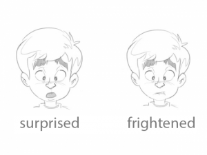
There are two more emotions that are less frequent, but they are also a part of the primary emotions group:
5. Surprise: mouth is small and half open, brows are raised high, eyes are open..
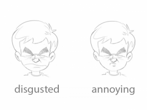
6. Disgust: mouth is curved, brows are completely wrinkled, eyes are closed.


Notice that these two expressions are actually modified expressions from the first group.

Right now you are probably surprised by how few primary emotions there are. It’s really simple though – just like you can make different colours by mixing the basic ones together, you can also mix the primary emotions to create more of them – the secondary emotions. Take a look at this example if you don’t believe us.
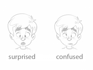
Derived emotions
These are emotions that are based on the primary ones. When drawing them, you can change just one facial feature of a basic emotion to obtain new, more nuanced ones!

Notice that we only changed the mouth but got two very different expressions just by doing that! Here’s another example of how just one element can change the entire emotion:


Again, we only had to change the mouth to change the entire emotion.
We can also change both the eyes and mouth to create yet another emotion, still based on the primary ones.


Furthermore, we can also combine and alter secondary emotions to create “tertiary” emotions! Just look at the example below:

The only thing we changed was – again – the mouth.

Fascinating, isn’t it? You can create dozens or even hundreds of different emotions just by altering different facial features and combining different expressions!

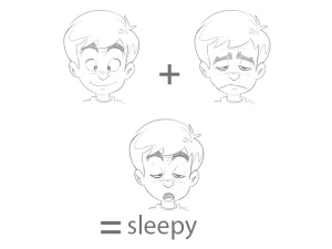
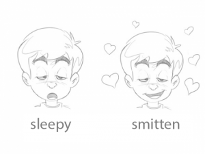
Emotions expressing physical states
Emotions that show how we feel physically are close relatives of the primary emotions, but unlike them, they can take on individual, unpredictable forms.

Notice that these “physical” emotions are, too, derived from the primary ones. Here you can see that tiredness is derived from sadness.

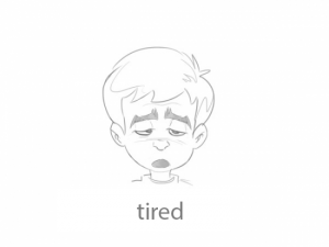
To make these “physical” emotions more prominent or specific, we can add extra features, like dripping sweat:

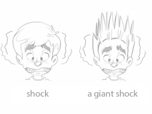
Now let’s take a look at a physical reaction we can’t fully control. Our poor character got a small electric shock, completely losing control over how they reacted.

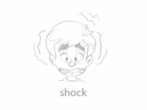
It is also important to keep in mind that primary emotions are the most frequent and prominent. Shock, however uncontrolled, is just a version of fear. The most interesting thing about the “physical” emotions is the fact that we experience them every day, without even realising it’s happening, with external factors and other conditions to blame for that.

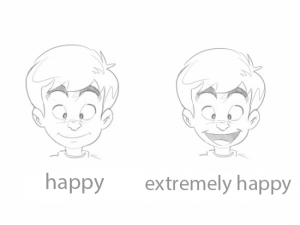
Intensity and other elements
In cartoon drawing, there is no limit on the intensity of facial expressions, so we can play with it as much as we like.

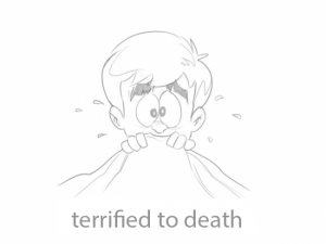
You can also add other elements to enhance emotions – like drops of sweat to enhance the feeling of fear, or a tongue sticking out to show how extremely disgusted our character is.

Would you like to explore emotions and facial expressions even further? Then come join us at our comic drawing course to get a ton of practice and learn to capture body language as well!

https://drawplace.drawplanet.cz/kurz/kurz-komiksu/

Watercolour pros and cons

3. February 2022

carissa-weiser-oPI3Oxj_cEw-unsplash

What makes watercolours so popular?

First off, they can be easily diluted with, you know, water, making a transition from one colour to the next practically invisible, creating a cool, transparent, smoky effect that is impossible to achieve with thicker materials like oil paint.

They are also ready to be used immediately, there is no need to make any preparations like thinning them down – just wet your brush and you are good to go. Combining colours or mixing a desired shade is also simple, and kids can also work with watercolours easily and comfortably.

Another great thing about watercolours is that they are non-toxic and odourless. They are also rather inexpensive, and you can use any paper that you have on hand, although you do need a special textured paper for the best results.

What makes watercolours not so great?

The main cons of watercolours are closely tied to their greatest pros. Paint transparency, one of the most praised properties of watercolours, makes it almost impossible to hide or correct mistakes. Furthermore, the colours do fade to a certain degree once the paint dries, causing a bit of a headache to beginner artists. 

Another downside is that you need to wait for one layer to dry completely before you can add another – otherwise you risk ruining your entire work.

Finally, there’s paper deformation – since watercolours are applied with a very wet brush, your paper is bound to get wrinkled to a certain degree. 

Don’t get discouraged though! You can easily learn to work with the downsides of watercolours – join our watercolour course to learn how! We promise that our amazing teachers will guide you to success 😊


How to draw a tree

3. February 2022

как-рисовать-деревья-20

One would think that a tree is one of the simplest things you can draw…but if you have never been too much into drawing, chances are your tree will end up looking too simplistic…


… or too detailed.


Neither of these two pictures resembles a real tree – the first is more like a symbol, while the other is more of a definition of a tree. But as an artist, your main task is to capture what you see, not what you know, and drawing trees is a great way to practice this.

In this blog post, we’ll teach you to draw a very realistic oak tree using a very simple method.

You will need:
–  a couple of sheets of paper;
– an HB pencil;
– a medium-soft pencil (2B);
– a soft pencil (5B);
– a pencil sharpener.

You can also make do with a couple of hard HB pencils, but they are not versatile enough to be used in any type of drawing – you need soft pencils to create rich, dark shadows, something you can’t achieve with hard pencils, no matter how hard you push.

Make sure to have a pencil sharpener handy as well – a blunt tip creates lighter and blurrier strokes that don’t match the expected result. Keep your pencils sharp and keep in mind that soft pencils blunt faster than hard pencils!

As for the paper, you don’t need anything too fancy – simple printer paper will do. Don’t make your drawing too big either – the smaller the picture, the less detail you need to add. For reference, the drawings you see in this article are only 9 cm tall.

Our brain works in a curious manner – it notices an entire object first and starts paying attention to details next. And that is why you don’t need to start creating your drawing from the details – you need a base first.

Step 1

Use a couple of very light strokes and dots to outline a simple tree shape. Use a harder pencil (HB) and don’t apply too much pressure – these strokes will not be a part of your finished drawing.

Step 2

Draw a trunk, making it wider at the bottom and narrower at the top. The bigger the tree, the shorter and wider the trunk.

Step 3

Add branches to the upper part of the tree. Keep in mind that tree branches gradually lower down as they grow and make sure to capture that as well.

Step 4

Draw smaller branches growing out of the large branches. The longer the branch, the lower the splitting begins. Keep your strokes light.

Step 5

Use short, quick strokes to outline the treetop and don’t make it too even.

Step 6

Draw the little leaf “clouds” in the treetop with the same short, quick strokes. Leave some areas empty to make some branches visible and make your drawing more lifelike.

Step 7

Make the branches thicker where there are no leaves covering them.

Step 8

Before you start shading, decide which part of the tree will be turned towards the light and where the shadows will be. You can outline them with simple hatching.

Step 9

Use a soft, sharp pencil (2B) to add texture to the trunk, leaving some white parts to capture the bark texture properly.

Step 10

Use soft pencils (2B, 5B) to darken the trunk, keeping in mind where you decided to put your light source and the corresponding light/shadow distribution. Don’t be afraid to apply more pressure to a soft pencil to get a deeper shadow but be careful to not overdo it. The fewer black areas you’ll have in the picture, the more realistic and impressive it’ll look.

Step 11

Grab a hard pencil and add leaf shapes by drawing relaxed, loose circles with quick, sharp movements.

Step 12

Every branch has its own little “treetop” (remember those “clouds” you drew?). Draw them as if they all were small separate trees. 

First grab a soft pencil (2B) and use it to make darker circles on the darker side of the tree. Don’t apply too much pressure at first to make it easier to correct potential mistakes. 

When you are sure that you have determined where your shadows will be correctly, add the shadows and depth, creating a transition between the dark and light parts.

Step 13

Use a soft pencil (2B) to add a couple of more pronounced leaves to the entire treetop and each individual “mini treetop” to create an illusion of more barely visible small branches.

Step 14

Now use the softest pencil you have to add a few dark accents to the darkest areas of the tree as well, creating more contrast in the treetop. Make sure that all leaves are darker than the “sky” (your background) – no leaves should appear transparent! Go over the light areas with a hard pencil one more time if necessary. 

So, drawing a tree wasn’t that hard, was it? All you need to do is capture their real appearance, not a definition of a tree from a dictionary. But this is just the start of your practice – if you want to become really good at drawing trees, make it a habit to carry a sketchbook with you when you go for a walk, look at the trees around you and try to capture them with quick sketches.

Do you love nature? We do for sure, which is why we have an entire course on painting and drawing landscapes at Draw Planet! Learn to work with pastels, coloured pencils, watercolours and oil paints, all the while creating amazing pictures of beautiful flora 😊

Drawing hands

3. February 2022

MultAXn

There seems to be a consensus among artists that hands are the most difficult thing to draw, with every artist having their own slightly shameful examples of hiding the hands of their characters inside their pockets or behind their backs just to avoid having to draw them. It is, therefore, rather ironic that we always carry the best model one could wish for with us, and right in front of us most of the time – our own hands. Using a mirror and a little effort, we can learn to draw hands in basically any position, from any angle. The only catch here is the fact that hands are very complex tools with many joints and other small details that often leave us at a loss and unable to decide where we even start.

The easiest way to draw a hand is to start with the palm – it should look like a round, rectangular or trapeziform steak with rounded corners, with fingers connected to it.

Now, if you have trouble drawing fingers, think of every finger as a series of interconnected cylinders – this should help you draw fingers from any angle. Just look at the picture below – cylinder edges become the lines where the fingers bend at the joints.

Don’t forget about fingernails either and learn to understand when you do and when you don’t need to draw them. As a general rule, only draw fingernails when the hand is close to the viewer and needs a lot of detail.

Overall, hands are very different and individual, just like faces. Men’s hands are different from women’s hands, old hands look different compared to young hands, and so on. You can see examples of some hand types below, but these are just a few examples of many, and in no way is this a representation of the whole range of hand diversity. When it comes to hand variety and differences, you’ll find that hands do have their own character too. 

-Different finger to palm ratios

-Finger shapes

To make matters even more complicated, fingernails are very different person to person as well! And even if the nail bed is the same size, manicure can still make them different.


Simple exercise
Examine your hands and the hands of other people. How are the fingers arranged? What are the differences between men’s and women’s hands? What about your grandma’s hands and your hands? Can you recognize your friends just by their hands? Sketch hands that you see around you or use referenceimages instead. Don’t worry about ratios – focus on capturing what the hands are doing. Try drawing your own hands in different positions, use a mirror to see them from different angles and views, always starting your drawing from the simplest shapes. You can also start with quick, energetic sketches and add details to them later.

Come join our figure drawing course and learn to capture the hands of live models (and much more) with our amazing teachers. We look forward to seeing you!


Jacksons_Tones_Atmos-1024×683

Every skin tone contains three basic colours – blue, red, and yellow – in different ratios depending on how light or dark the skin is, whether it’s in the shadow or out in the light, and also depending on the body part. For instance, thin skin, like that on your temples, tends to carry cooler shades while the tip of the nose is usually darker. The first thing to keep in mind is that there is no magic recipe to create the perfect, universal skin tone – you will have to learn to mix your own skin tones, and that’s where the colour ratios come into play.

Now that we’ve established how different skin tones are, our next piece of advice is to avoid those paint tubes with “universal skin tone”. You could use them as a base for mixing the shades you really need for your portrait, but since these pre-mixed skin tones are just a basic mix of blue, yellow, and red, there is no reason why you can’t do that yourself.

A simple mixing method

Start by mixing the same amount of each basic colour together – this will result in a brownish colour, a base that you will lighten and darken, make it warmer or cooler.

Note: if you get more of a greenish colour, simply add more red to balance it out since some paints and colours can be more dominant than others.

In portrait painting, just like in landscapes, your best bet is to try to capture the colour you see as closely as possible. Take a good look at the colour on your model picture or your live model’s body and try to create the same shade on your palette, comparing it to your model as you go to fine-tune and perfect it. Think of these questions as you work towards that perfect shade.

  1. Do I need a lighter or a darker shade? If the answer is lighter, add yellow or white. The white will also make the shade cooler and more coating, while the yellow will add warm undertones. Use dark ochres, rusty shades (like burnt umber) or chromatic blacks (like burnt sienna combined with ultramarine blue) to make your mix darker.
  2. Do I need a cooler or a warmer shade? Add blue (or white to simultaneously lighten the mix) to make your shade cooler. Use yellow or warm red to add warmth to your skin tone mix.
  3. Do I need to make my skin tone more or less saturated? Use the opposite colour to balance things out.

You can also use earthy colours like ochre, rust, or black shades, but keep in mind that even these can be created by mixing the three basic colours together. In the end, it’s up to you to decide what mix works best for you.

An example palette

Let’s take  a look at some colours that you can start with and then add, remove, or change colours on your palette to your liking.

  1. Titanium White
  2. Cadmium Red Light
  3. Cadmium Yellow Medium
  4. Ochre
  5. Burnt Sienna
  6. Burnt Umber
  7. Ultramarine Blue

For light skin tones, use a mix of 1, 2, 3, and 5.

For medium tones, use 2, 3, 4, and 5.

For dark skin tones, use 2, 5, 6, and 7.

Create a series of different shades for different colours that you use – for instance, keep adding more and more white to Cadmium Red, creating a variety of shades available to you. Do the same for your skin tone mixes to create a perfect dark-to-light palette to use for adding shadows and highlights to your portrait without having to mix a new shade from scratch every time.

A tip to get you started in skin tone mixology

Start by looking at your own skin and try to mix shades that match your hands. Take note of how different colours and shades look depending on different lighting and light sources. Next, try to mix a shade that matches your face, examining the colours and different shades you see in the mirror. Then, try to mix them from memory. Printing out pictures of people and trying to mix a shade to match their skin is also a great way to practice. Also, did you notice that not once did we use orange or pink  like we used to do as kids? 😊 

Want to learn more and become a real pro? Join us at our portrait drawing and painting course. We look forward to meeting you!

1-2017-Ilustrace-1-45

Our newsletter!