Go to

Draw Place Blog

tOGO3-dbBcI

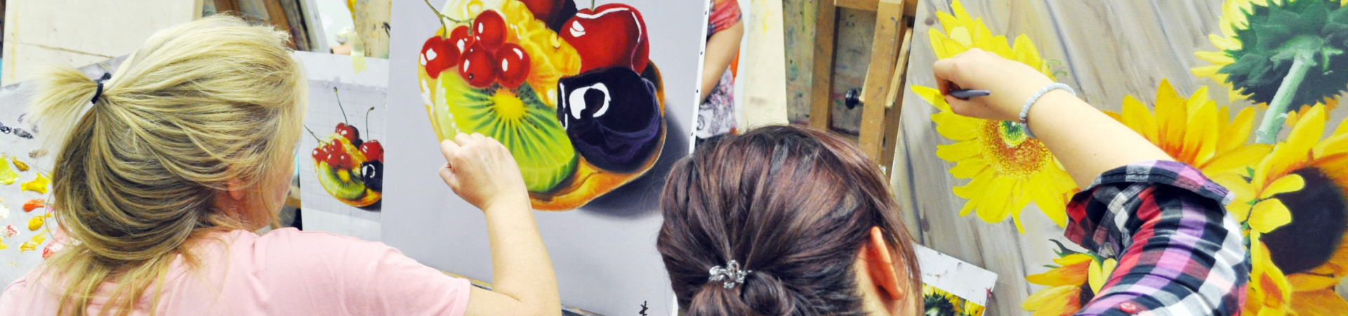
A beautiful, unique interior is something we all dream about, and surely many people have thought at some point – why don’t I paint something awesome on my walls with my own hands? The problem is, you immediately realize that you don’t know how – you’ve never done it before and perhaps you feel too left-handed to tackle something like that by yourself. But then, professional artists and designers are so expensive that ultimately you give up on that dream and slap on some wallpaper because it’s much easier. But what if you decide to fulfil this dream after all?

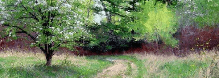
A wall is not a sketchbook – you don’t draw a random doodle that you just thought of on a wall. Choosing the right wall art image is almost as difficult as creating it – it has to match the style of the room, be in line with the room’s purpose and carry a certain emotion. There can be other purposes to it too, like making the room seem taller or hiding crooked walls. Most often, wall art is seen in children’s rooms because it brings them the most joy, especially when it’s their favourite cartoon characters on cute animals decorating their walls. 

But don’t despair, you can still decorate your wall with your own artwork, even if you aren’t exactly a professional artist!

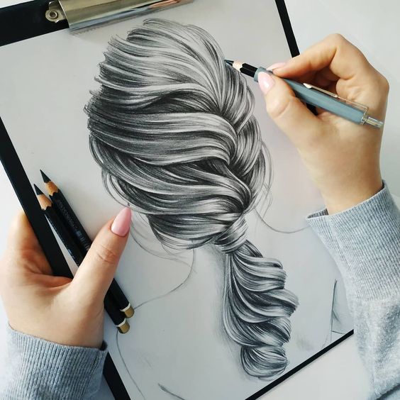
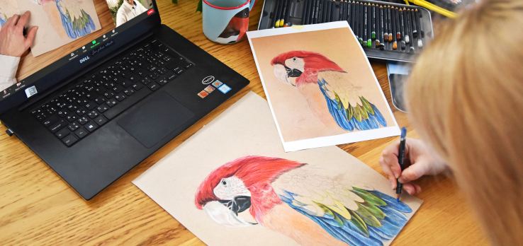
Step 1. Choose your picture and determine how big it’s going to be. In this guide we assume that you are at the point when you already know where exactly your picture is going to be and why. The internet is overflowing with billions of pictures, but we suggest starting with something on the simple side – don’t attempt to paint a giant flaming dragon just yet.

Step 2. Prepare your wall – experts work on smooth, clean, well-painted surfaces, so take care to smooth out your wall and choose a colour that will work as a background for your wall art.

What kind of paint can you use?

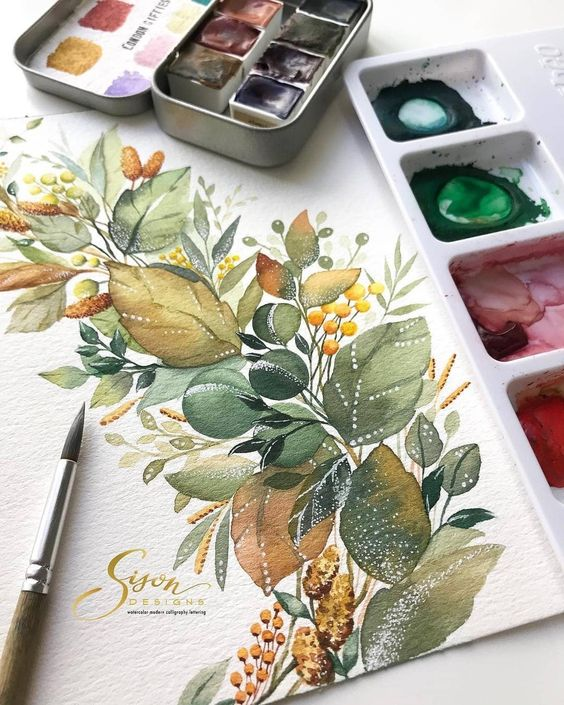
Step 3. Get your supplies: paints, brushes, etc. Get two types of brushes: large flat brushes for big, wide strokes (you can go for natural or synthetic) and small, round brushes for details. Make sure to get  some cups and containers to clean your brushes and mix colours – get the single-use kind if you don’t want to sacrifice your dishes. As for the paints, all experts agree that you should only use matte, water-based acrylics – they are easy to mix and apply and they won’t smudge once dry. Mix white acrylic paint into your colours to achieve the desired shade. To achieve the desired level of liquidity (a consistency resembling sour cream with 15% fat content is ideal), simply add water, but be careful and don’t get too carried away – you could end up with ugly spots on your wall when the paint dries. Some artists like to cover the entire finished painting with an extra layer or two of matte acrylic wall coating just to be sure.

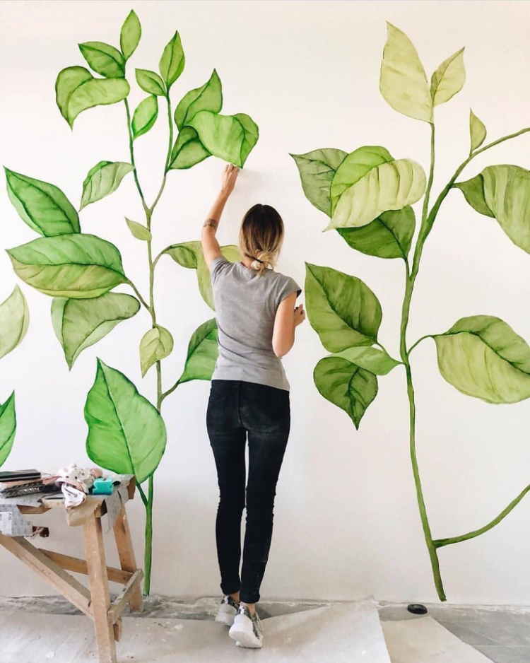
Step 4. Print out 5–10 copies of your template in black and white to create something like a sketch. Choose the background colour carefully – the same colour can look very different on a white or green background, so take care to choose colours that work well together. If your chosen painting contains lots of repeating elements (like leaves), it’s a good idea to make simple stencils before you begin.

Step 5. Now use a pencil to lay down a basic sketch on the wall. Avoid black pencils – they are very hard to erase and tend to leave ugly smudges. A soft coloured pencil is a much better option here since you can correct mistakes simply, with a large soft eraser. The better your sketch, the easier the painting stage will be. People who struggle with spatial orientation can use a grid – draw it on your printed template and on the wall. It will divide the image in smaller pieces, making it easier for you to transfer it from paper to the wall.

Step 6. Grab your acrylics and start painting! Always mix your colours right before you use them since acrylics dry very quickly. Don’t forget to repeat strokes to give your painting a more natural, three-dimensional look; just make sure to let the previous layer dry before going over the same spot again. Hold your brushes perpendicular to the wall. Use small brushes to correct any mistakes and move from the large brushes at the start to small brushes towards the end, adding the smallest details last – this way you can easily create volume, reflecting sun, and other natural effects in your wall art.


That’s everything you need to know to paint your own wall – good luck! And for those who would like to learn more about interiors, we invite you to register for our amazing interior design course where you will learn how to work with a floor plan, how to combine colours or even how to use a computer to create your interior in 3D!

62258331_2368780329835476_3138336799370248192_n

How do people take good photos of their artwork? And how do they publish them online?! Keep reading to learn their secrets!

Being a good artist is not enough these days – you also need to know how to make your art look good online. Photos of your art need to be as good as the artworks themselves to make the best impression on the viewers. Luckily, this article will help you take better pictures and teach you how to post them on social media and get the engagement and audience they deserve. 

Lighting

Good lighting is the number one factor in photographic quality. If you don’t have professional lighting equipment, use daylight to take photos of your artwork. Don’t rely on interior artificial lights – instead, take your picture outside, to the balcony, or at least place it close to a window. Avoid using a flash – it will create a strong reflection that never looks good. 

An overcast afternoon will offer the best possible lighting conditions (outside, of course). It is key that the light hits your artwork at an angle, not directly from above!

Photographing large paintings is a bit more difficult since it is likely that the lighting will be uneven. Luckily, there is a simple trick to help – place a large sheet of white paper next to the side of the painting with less light hitting it. Don’t worry about unwanted items in your frame – you can edit them out later.

You can showcase a picture simply by photographing it, or you can choose to get more creative and create an entire composition with brushes, pencils, paints and other items strewn around your artwork. Look for inspiration online and adapt the ideas that you like to suit your style and work.

Take time to learn to photograph and present your work in an attractive way – trust us, it will pay off! After putting so much effort into your work, it would be a shame to have a sloppy online presentation that doesn’t do it justice. 

Got nothing to present yet? Choose one of our courses and learn to make amazing artworks worthy of online presentation with us!


04698b9216a107bfddc24413598f7574

Are you tired of the cliché holiday movies like Love Actually? Get yourself a nice Hot Toddy and watch a movie on art instead! Here’s a selection of our favourites.

Hermitage – the Power of Art hit the big screen in 2019, inviting the viewers to travel into the past and experience the 250-year history of Hermitage and the magical streets of St. Petersburg. An Oscar-winning actor, Toni Servillo, will be your guide on this magnificent tour through the museum’s history, exploring it in the context of the Napoleonic wars, the Russian Revolution of 1917, the totalitarian era of the 20th century, and the modern era. The Hermitage collection contains artworks from the world’s most famous artists like Leonardo da Vinci, Raffael, Van Eyck, Reubens, Tiziano or Rembrandt, allowing you to see them on the big screen and in high resolution for the very first time.

Gauguin (2017)
A story about the French post-impressionist painter Paul Gauguin, following his journey from dark Paris to the sunny beaches of Tahiti which ultimately made his name forever etched in the world’s history of art. Gauguin arrives in Tahiti at the very start of the movie and allows us to follow his daily life in Tahiti, romantic adventures, but also his fight with an illness that came at the most productive time of his career. The great painter is played by the renowned French actor Vincent Cassel.

Loving Vincent (2017)
This Polish-British co-production movie was released in 2017 and it is a unique movie indeed – it is the first movie ever to be composed of oil paintings only. So, if you are a fan of this Dutch impressionist painter and his art, this movie is guaranteed to take your breath away. Allow yourself to become encompassed by his art, its atmosphere, learn about the people you see in his paintings, and follow Vincent van Gogh through the last stage of his life, so shrouded in secrecy.

Frida (2002)
A bright, vibrant movie about a bright, fierce, vibrant woman, burning passion, and untamed energy. Frida was only 20 years old when she married Mexico’s most famous painter, Diego Rivera, gaining a middle-aged husband characterized by wealth and depravity. The movie explores Frida as an artist, but also as a woman who valued love and family above all else.

Basquiat (1996)
This movie follows the short but dramatic life of the black painter Jean-Michel Basquiat, with New York’s art scene serving as the main backdrop. Discover a full portrait of the artist and all things that led to his self-destruction: his art, his lifestyle marked by the burden of fame, the countless romantic flings, and his affinity for drugs.

Pollock (2000)
Not many people can say that their art influenced a whole generation and set the course for future artists. A few names do come to mind, like Russia’s Kazimir Malevich or Salvador Dali of Spain. But what about the USA? Well, there was Jackson Pollock, an untamed genius who met a tragic end and managed to revolutionize abstract art in just a few short years. In 1941, a fellow artist and his future partner, Lee Krasner, discovered his talent. However, their happiness was short-lived – Pollock’s soul was tarnished by his inner demons, slowly pushing him down a path of self-destruction and ultimately making his life short but incredible – and that’s what this movie is about.

Banksy: Exit Through the Gift Shop (2010)

This story is almost unbelievable, but every inch of it is true. An eccentric, bourgeois French documentary-maker from Los Angeles embarks on a quest to find and befriend Banksy. This documentary earned an Oscar nomination for the best picture in the category. Embark on a journey that will let you see inside street and modern art, where talent means almost nothing, and good marketing means almost everything.

Topics

green_m

Everyone likes a summer landscape, but for a beginner, this can be a daunting task. However, there is one important trick to keep in mind: it’s in the light that inevitably touches the green of the trees, but most people forget about it and only use two or three colours for all greenery in their landscape, ending up with a rather child-like creation. So, how do you paint a realistic green landscape?

First off, the “green” you see in the scene might actually not be green at all, even dabbling into grey-brown or carmine here and there. Let’s use works by Mark Hanson to demonstrate the principles behind painting green trees. We identified the exact shades in several spots in the painting to see what colours are really at work.

1)  The first picture shows clear shades of green that you can create using paints found in every common paint set. The beginners, however, tend to think that there is no mixing involved in these colours, which is a mistake – the bright green colours are actually rather rare in real forests. We also need to consider the painting’s circumstances – it captures the start of summer, with a bit of an overcast. The leaves are still young and at about the same distance from all objects in the painting.

2) In other seasons, however, the brightness steps aside, making space for less vibrant shades and different colours on different trees. At this time of year, you are likely to see different types of young leaves or needles, some dark like pine trees, some in cooler shades, like olive or willow trees. Different wood colours must be kept in mind as well.

3) Bright sunlight changes the painting radically. On an overcast day, the colour appears to be more or less the same across the entire treetop, but when sun comes into play, the colours in the shaded and highlighted areas are vastly different, with the light making the colours vibrant and warm and the shadow dimming and darkening them. In this picture, you can also see that the colours are different due to the distance, with the shadows on more distant trees being brighter and cooler compared to those of their neighbours.

4) The further the trees are from the viewer, the more their colour changes compared to the trees in the foreground, transitioning from green to grey. This is caused by the fog that diffuses the colour and introduces milky shades of blue and purple into the green treetops, and the more distant the object, the more fog between the object and the viewer. Just look at the rich and complex shades in this painting.

5) The colours change even more drastically once more complex lighting conditions come into play, like dusk, sunset, dawn, or darkness of the night. In such cases, all conditions that allow green to be more prominent are gone, and the trees become blue-green, grey, or even red.

Keep in mind that there isn’t a single drop of green in this picture, even though we all know that trees are green. However, our brain is used to green trees, yellow sun, and blue sky, so even when our eyes clearly paint a different picture, the brain still makes us reach for the green paint to make a green tree.

How can you “see” the colours with your mind?

There is a very simple tool that you can use. Grab a small strip of paper or cardboard and make a small hole inside it. Now place the hole over the area the colour of which you need to determine. The paper separating your spot from the rest of the scenery will help you see the colours in the hole clearly.


This little trick is especially useful when you are painting trees that are far away from the viewer – remember, the further they are, the less green they become, it’s just our brain that refuses to see it. Go ahead and try it yourself!

Get a photo of a tree or use your hole in the paper to look out the window. Try first looking at a tree like you normally would, then place your “tool” 30–50 cm away from your eyes and cover one eye with your palm. Use white paper for your “tool” and make sure it’s well-lit to ensure that your measurements are correct. Next time you decide to paint a landscape, you will already have a great method to determine if the colour you see really is green. 


Are you a nature lover? Would you like to learn to paint your own amazing landscapes? Sign up for our landscape painting course for beginners and come learn with us!


How to draw hair

5. February 2022

2e67119408d89c2ffb102b987c884e79

Drawing hair may seem daunting and difficult, but it’s really not that bad! The secret is the hair structure – unlike other head and facial elements, hair doesn’t have too many unique, defining characteristics; it only differs in colour, volume, and waviness. That’s why we will learn to draw a face actually starting with the hair before adding other features.

Real-life anatomy

Hair plays an important role in portrait construction since it makes up for a large portion of the actual head shape – and that’s why you need to be familiar with the anatomy of a skull.A skull is much like a ball, but if you just add some hair around it willy-nilly, your human will look more like a poodle-alien. To avoid this, keep in mind that a human skull is not, in fact, a perfectly round ball.

The forehead is more like a flat wall, with ears connected by temporal bones that are more airplane shaped. Only the parietal and the occipital bones are actually sphere shaped. 

Always keep the head shape in mind – regardless of the hairstyle, there is always a skull underneath it, with the hair following the skull shape or standing out, not shaping the skull.

So how do you draw hair?

Now let’s get to work and learn to actually draw some hair step by step.

First and foremost, don’t draw hair without having a base – that would be the skull. Try to define the main parts of your hair by following the skull shape and decide how the hair will be arranged geometrically. Follow the temporal (front view) or the parietal or the occipital bone (profile and three-quarter view). Pay special attention to the little curls on the forehead.

Remember that hair is much better at reflecting light than our skin and keep this in mind when shading and adding highlights and contrast. To add shading, use long, neat strokes following the shape of the head, basically adding individual hairs. Make sure you know how to properly hold a pencil to keep them nice and neat. Let’s not forget about aerial perspective too! Only the hair closest to the viewer should be visible; the hair in the background will usually merge into a single body. To achieve this effect, simply use a piece of paper to blend out your strokes. When you feel confident about being able to follow the rules above, go ahead and dive into your first hairstyle!

Pencil

Let’s go back to the top of the head for a moment. There is a secret you need to know – you can do all of the above without a model or a reference picture since all heads are built following the same set of rules.

Try and see it for yourself – get yourself a life model (with hair, obviously – bald models won’t do here) who is ready to be immortalized on paper and compare the scheme to what you see. 

Now let’s find the frontal eminences (two rounded elevations on the frontal bone of the skull) – they are usually located at the intersection point of the upper row of the square we used to draw the face in and the vertical sides between the eyes and the ears (closer to the ears). These points mark the zones between the eyes and ears (the frontal and the parietal zone).

You will also need to determine the height of your hairstyle – go ahead and draw the shape of each zone, keeping the added distance in mind.

Now add detail to hair strands around the forehead and give them the desired shape, then move on to shading when you feel like your hair construction is done. Start from the darkest areas (shadows and cast shadows), then move on to midtones and finish with highlights.

Here’s a useful little trick for you: grab a rectangular eraser and cut it across, creating two triangle pieces – now you have two erasers with fine tips to comfortably erase the smallest lines and add gentle highlights and glowing spots of light!

Highlight the hairs in the front with bold, confident strokes and add any hair that is not on the parietal plane around the edges. 

Are you intrigued and ready to start? Dive straight into it, and if you want to learn from the best, sign up for one of our courses! We suggest taking a look at our portrait drawing course to really master hair with ease and confidence.


IMG_7051

Our newsletter!