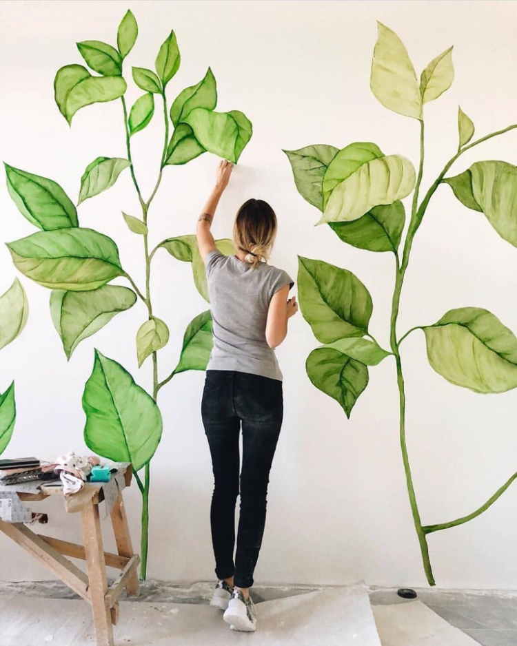
Go to

#painting

df56fd7a619a70f4fff1281e7eee664a

If you want to get some useful tips on how to hang paintings, how to arrange them into one coherent composition, and how high you should hang them, keep reading!

Here are our tips on decorating your interior with pictures and paintings:

1. Arrange your pictures on the floor or against the wall before you start hammering in nails – this will help you see the whole composition and choose the final layout.

2. Determine the surface that will be taken up by the finished arrangement and keep it under 2/3 of the wall’s surface.
 
3. To make your pictures truly stand out, hang them on a light wall – it can be completely white, painted in pastel shades or covered with light wallpaper.

4. Horizontal pictures will make the wall look longer while vertical paintings will visually lift the ceiling.

5. It’s important to hang your pictures at the right height to make sure they are easy to see. Use the imaginary line passing right through the middle of a picture as a guide. The classic “museum style” approach is to hang the picture at 152 cm from the floor to this imaginary midline.

6. Consider hanging the pictures lower in the kitchen and the dining room, since you will likely be sitting at a table, not standing when you observe them.

7. If you don’t plan on simply placing your picture on the floor and letting it lean against the wall, don’t hang anything below 60 cm.

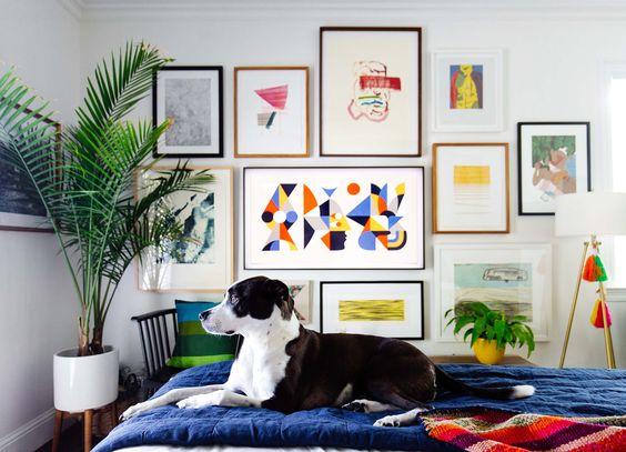
Interior picture layout: three basic methods
1. The symmetric approach


Symmetry is very harmonic, bringing a sense of order and allowing the viewer to comfortably take in the entire composition and making the home feel cosier. The pictures are hung to create a mirror image on every side of an imaginary midline. The bottom line can be aligned at the same height, or at a different height too – in that case, the pictures are hung on an imaginary horizontal midline.

2. Top or bottom alignment

You can choose to align pictures either at the top or the bottom line – you’ll be surprised how good it looks, giving the composition an anchoring point and a sense of stability and order.

3. The asymmetric approach


Asymmetry brings in a live dynamic sense, grabs the viewers attention and pulls everyone’s eyes to the wall and the composition. It also allows you to combine different picture sizes and formats, forcing you to think carefully about the entire layout. 

Keep in mind that creating a good asymmetric composition is not easy, requiring a keen sense of composition.


aecb0c21a8f2828de1a76cc4cce3ae1d

Sometimes you really want to draw something, but just can’t decide what and end up not drawing anything at all because of how unmotivated you become by the undecidedness. Sound familiar? We know that feeling too, and that’s why we have put together a list of 25 topics and ideas for when you get that sketching itch. 

  • City sketching – capture some of your favourite places 
  • Quick sketches of people on public transport
  • Put your dreams and ambitions on paper
  • You can never go wrong with a self-portrait
  • Create your own world in your own comic strip – and don’t get discouraged if it doesn’t look like a Marvel or DC production 
  • Make fun of your friends and draw their caricatures
  • Make a study of the human body – try skull or muscle anatomy, or a hand – few things are more difficult to do well than hands
  • Recreate your favourite moments from movies or series
  • Try bringing some flora and landscape into your sketchbook, and if you love being outside, take your sketchbook with you
  • Imagine you are a graphic designer and create a new logo for your favourite band
  • Draw a place that you’d like to visit someday
  • A still life is always a great option – find inspiration in the items around you, inside the fridge, or try copying a picture from the internet
  • Try making some cool tattoo designs
  • Whip up some fun clothing prints – what would your own t-shirt look like?
  • Try capturing your future the way you want it to be
  • Create illustrations for your favourite book
  • Empty your purse or pockets and draw what you see – this is also an exercise you get to try at our sketching course 😊
  • Design whatever you feel like – from a piece of furniture to an entire room
  • Try your hand at architecture, starting with simple scenes and working your way to full streets and blocks
  •  
  • Draw some food (not recommended when you’re hungry, though 😊)
  • Draw scenes from a normal day in your life
  • Capture your workplace or workspace
  • Spend some time just doodling (draw pictures or patterns without focusing on them but instead thinking of other things) – you may be surprised with the results
  • What was the best day of your life? Try putting that amazing memory on paper
  • And most importantly – draw things that make you happy 😊

Do you want to learn to capture the world around you? Come learn all the sketching tricks with us! It’s not nearly as hard as it might seem and soon enough you’ll be able to capture items, food, streets, nature, and people with quick sketches!


Colour mixing theory

10. February 2022

MicrosoftTeams-image

Painting is more than just applying pigment to a canvas, and the way you mix colours is just as important as your style or technique. Choosing the right shades can greatly affect the emotions conveyed by your painting – just think of Picasso’s “Blue Period” works. Would they have the same effect without those blue tones?

Whatever medium you are using, understanding and learning to mix colours properly is key. Most beginner artists tend to use only the colours that come directly out of the paint tube, but these shades are often oversaturated, flat, or simply unnatural. By learning to mix colours, you can create much more beautiful shades and save some money on top of that too since you won’t need to purchase a tube of every colour you might want to use.

To help you truly master the art of colour mixing, we put together a simple colour theory overview.


  • PRIMARY COLOURS 


The primary colours are blue, yellow, and red. All other colours are created by mixing these three together, so if you want to keep your palette minimal, primary colours are a must since you can mix any other shade using just them.


  • SECONDARY


When you mix two primary colours together, you get a secondary colour. Red and blue result in purple, blue and yellow in green and finally, red and yellow will result in orange.


  • TERTIARY 


As the name suggests, tertiary colours are created by mixing primary and secondary colours. There is a total of six tertiary colours: vermilion (red–orange), amber (yellow–orange), chartreuse (yellow–green), teal (blue-green), violet (blue–purple), and magenta (red–purple). These shades can vary, and you are free to adjust them as you see fit. For instance, you can make your vermilion more yellow and less orange by working with ratios of each composite colour.

Colours are all about ratios, and one shade can look very different depending on how you mix it. Always keep the colour wheel and each colour’s position in mind when pairing and mixing different shades. The colours that are opposite of one another on the wheel are complementary colours, which means that red and green, blue and orange, and purple and yellow will always look great together.

Colour mixing is a bit of a mysterious discipline, like alchemy, and it certainly requires a lot of practice to go with the theory. Join us at our oil painting course for beginners and learn the secrets of colour mixing with us!

https://drawplace.drawplanet.cz/kurz/kurz-kresleni-a-malovani-pro-uplne-zacatecniky/

tOGO3-dbBcI

A beautiful, unique interior is something we all dream about, and surely many people have thought at some point – why don’t I paint something awesome on my walls with my own hands? The problem is, you immediately realize that you don’t know how – you’ve never done it before and perhaps you feel too left-handed to tackle something like that by yourself. But then, professional artists and designers are so expensive that ultimately you give up on that dream and slap on some wallpaper because it’s much easier. But what if you decide to fulfil this dream after all?

A wall is not a sketchbook – you don’t draw a random doodle that you just thought of on a wall. Choosing the right wall art image is almost as difficult as creating it – it has to match the style of the room, be in line with the room’s purpose and carry a certain emotion. There can be other purposes to it too, like making the room seem taller or hiding crooked walls. Most often, wall art is seen in children’s rooms because it brings them the most joy, especially when it’s their favourite cartoon characters on cute animals decorating their walls. 

But don’t despair, you can still decorate your wall with your own artwork, even if you aren’t exactly a professional artist!

Step 1. Choose your picture and determine how big it’s going to be. In this guide we assume that you are at the point when you already know where exactly your picture is going to be and why. The internet is overflowing with billions of pictures, but we suggest starting with something on the simple side – don’t attempt to paint a giant flaming dragon just yet.

Step 2. Prepare your wall – experts work on smooth, clean, well-painted surfaces, so take care to smooth out your wall and choose a colour that will work as a background for your wall art.

What kind of paint can you use?

Step 3. Get your supplies: paints, brushes, etc. Get two types of brushes: large flat brushes for big, wide strokes (you can go for natural or synthetic) and small, round brushes for details. Make sure to get  some cups and containers to clean your brushes and mix colours – get the single-use kind if you don’t want to sacrifice your dishes. As for the paints, all experts agree that you should only use matte, water-based acrylics – they are easy to mix and apply and they won’t smudge once dry. Mix white acrylic paint into your colours to achieve the desired shade. To achieve the desired level of liquidity (a consistency resembling sour cream with 15% fat content is ideal), simply add water, but be careful and don’t get too carried away – you could end up with ugly spots on your wall when the paint dries. Some artists like to cover the entire finished painting with an extra layer or two of matte acrylic wall coating just to be sure.

Step 4. Print out 5–10 copies of your template in black and white to create something like a sketch. Choose the background colour carefully – the same colour can look very different on a white or green background, so take care to choose colours that work well together. If your chosen painting contains lots of repeating elements (like leaves), it’s a good idea to make simple stencils before you begin.

Step 5. Now use a pencil to lay down a basic sketch on the wall. Avoid black pencils – they are very hard to erase and tend to leave ugly smudges. A soft coloured pencil is a much better option here since you can correct mistakes simply, with a large soft eraser. The better your sketch, the easier the painting stage will be. People who struggle with spatial orientation can use a grid – draw it on your printed template and on the wall. It will divide the image in smaller pieces, making it easier for you to transfer it from paper to the wall.

Step 6. Grab your acrylics and start painting! Always mix your colours right before you use them since acrylics dry very quickly. Don’t forget to repeat strokes to give your painting a more natural, three-dimensional look; just make sure to let the previous layer dry before going over the same spot again. Hold your brushes perpendicular to the wall. Use small brushes to correct any mistakes and move from the large brushes at the start to small brushes towards the end, adding the smallest details last – this way you can easily create volume, reflecting sun, and other natural effects in your wall art.


That’s everything you need to know to paint your own wall – good luck! And for those who would like to learn more about interiors, we invite you to register for our amazing interior design course where you will learn how to work with a floor plan, how to combine colours or even how to use a computer to create your interior in 3D!

green_m

Everyone likes a summer landscape, but for a beginner, this can be a daunting task. However, there is one important trick to keep in mind: it’s in the light that inevitably touches the green of the trees, but most people forget about it and only use two or three colours for all greenery in their landscape, ending up with a rather child-like creation. So, how do you paint a realistic green landscape?

First off, the “green” you see in the scene might actually not be green at all, even dabbling into grey-brown or carmine here and there. Let’s use works by Mark Hanson to demonstrate the principles behind painting green trees. We identified the exact shades in several spots in the painting to see what colours are really at work.

1)  The first picture shows clear shades of green that you can create using paints found in every common paint set. The beginners, however, tend to think that there is no mixing involved in these colours, which is a mistake – the bright green colours are actually rather rare in real forests. We also need to consider the painting’s circumstances – it captures the start of summer, with a bit of an overcast. The leaves are still young and at about the same distance from all objects in the painting.

2) In other seasons, however, the brightness steps aside, making space for less vibrant shades and different colours on different trees. At this time of year, you are likely to see different types of young leaves or needles, some dark like pine trees, some in cooler shades, like olive or willow trees. Different wood colours must be kept in mind as well.

3) Bright sunlight changes the painting radically. On an overcast day, the colour appears to be more or less the same across the entire treetop, but when sun comes into play, the colours in the shaded and highlighted areas are vastly different, with the light making the colours vibrant and warm and the shadow dimming and darkening them. In this picture, you can also see that the colours are different due to the distance, with the shadows on more distant trees being brighter and cooler compared to those of their neighbours.

4) The further the trees are from the viewer, the more their colour changes compared to the trees in the foreground, transitioning from green to grey. This is caused by the fog that diffuses the colour and introduces milky shades of blue and purple into the green treetops, and the more distant the object, the more fog between the object and the viewer. Just look at the rich and complex shades in this painting.

5) The colours change even more drastically once more complex lighting conditions come into play, like dusk, sunset, dawn, or darkness of the night. In such cases, all conditions that allow green to be more prominent are gone, and the trees become blue-green, grey, or even red.

Keep in mind that there isn’t a single drop of green in this picture, even though we all know that trees are green. However, our brain is used to green trees, yellow sun, and blue sky, so even when our eyes clearly paint a different picture, the brain still makes us reach for the green paint to make a green tree.

How can you “see” the colours with your mind?

There is a very simple tool that you can use. Grab a small strip of paper or cardboard and make a small hole inside it. Now place the hole over the area the colour of which you need to determine. The paper separating your spot from the rest of the scenery will help you see the colours in the hole clearly.


This little trick is especially useful when you are painting trees that are far away from the viewer – remember, the further they are, the less green they become, it’s just our brain that refuses to see it. Go ahead and try it yourself!

Get a photo of a tree or use your hole in the paper to look out the window. Try first looking at a tree like you normally would, then place your “tool” 30–50 cm away from your eyes and cover one eye with your palm. Use white paper for your “tool” and make sure it’s well-lit to ensure that your measurements are correct. Next time you decide to paint a landscape, you will already have a great method to determine if the colour you see really is green. 


Are you a nature lover? Would you like to learn to paint your own amazing landscapes? Sign up for our landscape painting course for beginners and come learn with us!


Watercolour pros and cons

3. February 2022

carissa-weiser-oPI3Oxj_cEw-unsplash

What makes watercolours so popular?

First off, they can be easily diluted with, you know, water, making a transition from one colour to the next practically invisible, creating a cool, transparent, smoky effect that is impossible to achieve with thicker materials like oil paint.

They are also ready to be used immediately, there is no need to make any preparations like thinning them down – just wet your brush and you are good to go. Combining colours or mixing a desired shade is also simple, and kids can also work with watercolours easily and comfortably.

Another great thing about watercolours is that they are non-toxic and odourless. They are also rather inexpensive, and you can use any paper that you have on hand, although you do need a special textured paper for the best results.

What makes watercolours not so great?

The main cons of watercolours are closely tied to their greatest pros. Paint transparency, one of the most praised properties of watercolours, makes it almost impossible to hide or correct mistakes. Furthermore, the colours do fade to a certain degree once the paint dries, causing a bit of a headache to beginner artists. 

Another downside is that you need to wait for one layer to dry completely before you can add another – otherwise you risk ruining your entire work.

Finally, there’s paper deformation – since watercolours are applied with a very wet brush, your paper is bound to get wrinkled to a certain degree. 

Don’t get discouraged though! You can easily learn to work with the downsides of watercolours – join our watercolour course to learn how! We promise that our amazing teachers will guide you to success 😊


How to use acrylics

1. February 2022

Bez názvu-rrrrr

Have you been painting for some time now and decided that it was time for something new? Acrylics should be right on your radar! Thanks to their plastic base, acrylics give paintings an interesting volume and structure, while using them isn’t any more difficult than using watercolour. Finished paintings don’t need to be fixed – acrylics maintain their bright colours, are waterproof, and long-lasting.

1. Acrylics – what are they?

2. How to create a base for your painting

3. Learn to paint with acrylics

4. Useful tips and tricks


Acrylics – what are they?

Acrylics entered mass production rather recently, some 50 years ago. Thanks to their versatility and long life, pigmented acrylic resin quickly gained popularity and today, it’s used by painters, but also by interior artists who use them to create murals, or even builders and manicurists.

There are different types of acrylics, too. You would be wise to choose special, thick acrylics to decorate a wall or a ceiling since they can add volume and bring colour, realism, and a unique touch to the interior décor. For traditional canvas painting, less concentrated paints work better, and you can usually buy them in tubes. Working with acrylics is especially fascinating for beginners who can use them to discover their artistic abilities step by step.

How to create a base for your painting

Before you run to grab your paints, you need to make some basic preparations. You can use a wooden board or plywood as your canvas or go for a traditional canvas as well. You can also use paper, which is the best option for beginners who have just started working with acrylics.

Make sure to get thick paper with a rough surface – you will need a firm surface to apply acrylic paint properly, so make sure to tape your textured paper to a wood board if that is your canvas of choice.

Use a book to remove any air bubbles and voila, your canvas is ready! If you decide to make our own wood frame canvas, you will have to sand it first because acrylics do best on a smooth surface. Beginners often wonder what kind of a surface is hidden beneath the acrylic paint.

If you decide to go for boards instead of canvas, you will need to apply a base layer of acrylic paint that you can buy in any art supplies store. It’s a special emulsion with titanium dioxide that works as a whitener. Apply several layers of this primer to your board and let it dry for a day.


Learn to paint with acrylics

Before you begin, make sure your paints haven’t dried out and keep the palette with your paint wet when you apply the first strokes. A spray bottle is a handy tool to have since you don’t need to pour a ton of water on the acrylics at once. Use an absorbing paper – placing it under your palette is a smart idea.

Check how transparent or opaque your paint is – the more water you use, the more transparent the strokes will be. Use the large brushes first and start with big, broad areas, then make your way to smaller brushes and details. Painting with acrylics on paper or wood board requires total concentration and precision. Use a mirror to check your work’s proportions from time to time.

Beginners often have trouble mixing acrylics. You can dilute your paints a bit more before mixing – this way, the colours will stay “open” longer, which makes it easier to achieve the desired result. Make sure to only use the tip of your brush. To get a clear contour, you can use masking tape or painter’s tape that you can easily buy at any hardware store.

If you need to lighten or darken a colour, try adding white or black. To clean a palette that was used for acrylics, use any solvent suitable for acrylics.


Useful tips and tricks

Applying acrylics to wood or paper is a fun creative process full of surprises. Here are some tips and tricks for you to make it even more fun and encounter fewer unpleasant surprises.

The colours will darken significantly once dry, so keep that in mind when you’re choosing them. Use non-toxic materials – they are more expensive, but they are worth it. Don’t forget to wear an apron to protect your clothes. 

Apart from professional brushes with long handles, paints, and canvas primers, consider also getting some decoupage glue and a spray bottle to fill with water.

When choosing a palette, opt for a plastic one – it’s practical and easy to clean. Don’t forget to always have a cup of clean water nearby to rinse and wet your brushes.

Once mastered, acrylics offer immense possibilities and you can create all sorts of masterpieces! Patience, practice, and the right supplies are the key to impressive results.

Would you like to try working with acrylics? Come to Draw Planet and join our acrylics course. Together, we can do it!


IMG_7051

Our newsletter!