Arranging paintings and pictures in your interior
11. February 2022
Back to blog
If you want to get some useful tips on how to hang paintings, how to arrange them into one coherent composition, and how high you should hang them, keep reading!
Here are our tips on decorating your interior with pictures and paintings:
1. Arrange your pictures on the floor or against the wall before you start hammering in nails – this will help you see the whole composition and choose the final layout.
2. Determine the surface that will be taken up by the finished arrangement and keep it under 2/3 of the wall’s surface.


3. To make your pictures truly stand out, hang them on a light wall – it can be completely white, painted in pastel shades or covered with light wallpaper.
4. Horizontal pictures will make the wall look longer while vertical paintings will visually lift the ceiling.
5. It’s important to hang your pictures at the right height to make sure they are easy to see. Use the imaginary line passing right through the middle of a picture as a guide. The classic “museum style” approach is to hang the picture at 152 cm from the floor to this imaginary midline.
6. Consider hanging the pictures lower in the kitchen and the dining room, since you will likely be sitting at a table, not standing when you observe them.
7. If you don’t plan on simply placing your picture on the floor and letting it lean against the wall, don’t hang anything below 60 cm.
Interior picture layout: three basic methods
1. The symmetric approach

Symmetry is very harmonic, bringing a sense of order and allowing the viewer to comfortably take in the entire composition and making the home feel cosier. The pictures are hung to create a mirror image on every side of an imaginary midline. The bottom line can be aligned at the same height, or at a different height too – in that case, the pictures are hung on an imaginary horizontal midline.
2. Top or bottom alignment

You can choose to align pictures either at the top or the bottom line – you’ll be surprised how good it looks, giving the composition an anchoring point and a sense of stability and order.
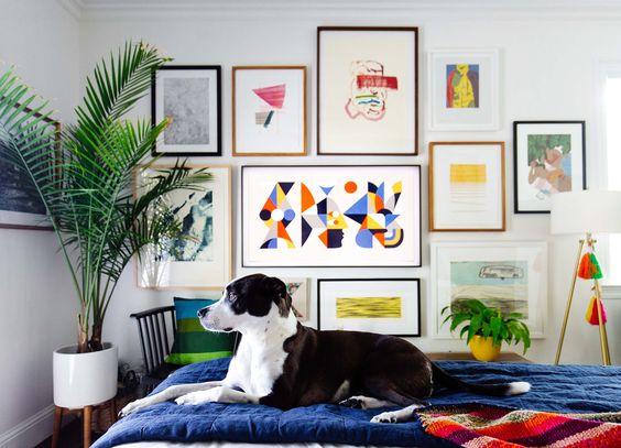
3. The asymmetric approach

Asymmetry brings in a live dynamic sense, grabs the viewers attention and pulls everyone’s eyes to the wall and the composition. It also allows you to combine different picture sizes and formats, forcing you to think carefully about the entire layout.
Keep in mind that creating a good asymmetric composition is not easy, requiring a keen sense of composition.


